By Marina
Correa
Photography:
Jonathan Richards - Picture Studios Ltd
for Custo Barcelona store; Felipemardones for Munich store
 |
| . |
Two fashion label stores in two different
continents have been designed by Barcelona-based design studio Dear Designs, where
geometrical silhouettes play the models but the real show-stoppers are subtly intrinsic
to the brand’s DNA...
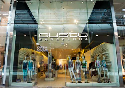
The firm has created a dramatic geometrical
ceiling structure, made from a complex assortment of abstract vectors, which
resembles a retail theatre in Custo Barcelona’s first store in the UK.
 |
| . |
But the studio wasn’t satisfied in only making a design statement; it delved deeper into the brand’s history and decided to anchor the store’s concept in its Mediterranean origins.
 |
| . |
Re-interpreting the topography and geological features particular to the
Mediterranean coast, the 1,600 sq ft store’s all-white palette aptly showcases
the brand’s graphic-led kaleidoscope of prints and cutting-edge fabrics.
In terms of materials, the store features white
timber wall panels, stainless steel hanging rails, grey resin flooring and
interactive mirrors generating light and shadow, textures and volume,
geometrical forms and silhouettes that reflect the intrinsic values of the
brand.
The other boutique designed by the same
architectural firm is Munich, the fashion and sports footwear store, located in
Santiago, Chile and is inspired by a stadium. Bright illumination and a
geometrically-designed hanging metal structure in the shape of X’s
conspicuously frame the store’s interior, where lines are blurred between the
boutique’s window display and furniture.
 |
| . |
The fractal design in the form of infinitely repeated X’s has been devised keeping in mind the brand’s logo and provides a depth, albeit subtly, to the geometrical skeleton. The fractal design lends itself to plenty of niches, where each shoe is nestled, sans visible support, and seems to be floating in animated suspension.
 |
| . |
Another notable aspect of this project is the use
of a simplistic material palette. The perimeter structure is sheathed in sheets
of glossy white lacquered iron, interior lettering in Corian, Barrisol
stretched ceiling, white polyurethane resin with a glossy varnished finish flooring
and white skin and iron sheets are used for the furnishings.
Both projects have been bagging awards and we
aren’t really surprised, given their designs’ inherent strengths.


No comments :
Post a Comment