Compiled by Teresa Simon
Photography: Courtesy B+H
Architects
Rejuvenating a
brand speaks volumes about the brand identity, its USP and its projected future,
all rolled into a single wholesome experience. When B+H Architects were asked
to work on the new flagship store in Hong Kong to augment the launch of Paul
& Shark into the Asian markets, they capitalized on two aspects: fine
craftsmanship and innovative spirit of the brand.
Being a premium
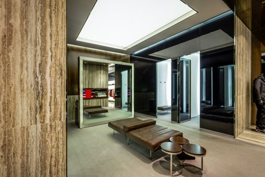
luxury sportswear brand, the 3,500 square feet store adopts the classic Italian
minimalist elegance blended with contemporary archetypal elements such as
steel, wood, glass and leather. A series of arches, clad in glass and
eucalyptus wood, optimize the existing retail area and divide the space into
sections of display shelves. Eucalyptus shelves and back-lit translucent glass
walls offer a clean palette, keeping the focus on the merchandise.
.jpg) |
| Sectional Displays |
The main entrance and windows lead the way through vertical blinds of wood and steel, whose double sides offer visual transparency into the store and flexibility for window setting, along with an LED screen on the side, showcasing the latest collection.
Inspired by the
rolling waves, the navy blue aluminum sheet patchwork of the façade creates
shimmering curves and glittering ripples, emphasizing the Paul & Shark logo
ahead of the abundance of luxury brands along Canton Road, where the flagship
is situated. The exterior blue metal facade finds a fitting complement in a
wavy wood feature wall that contributes to the natural and warm ambiance indoors.
The area around the feature wall doubles up as a luxury collection lounge,
heightening the shopper’s experience.
To further
deliver brand consistency, B+H have also custom designed the clothing hangers and
all luxury lounge furniture. The redesigning exercise is ably hand-held by Paul
& Shark’s Managing Principal, Susanna Swee and Design Principal, Jean
Sebastien Bourdages.
Following this
success, the B+H design has been applied in Paul & Shark stores in Milan,
Mexico and Istanbul; Macau, Shanghai and Chengdu stores.

.gif)
.jpg)
.jpg)
.jpg)

No comments :
Post a Comment