By
Pari Syal
Photography:
Courtesy Huma Design
The new office of digital retail Ssense in Montreal, Canada, is a monochrome composition that is edgy, contemporary, and exudes luxurious overtones...
Black & White are two such colours that can stand alone in awe-inspiring sophistication. Black creates mystery and White creates drama. Both indicate high levels of contrast and the key, as always, lies in creating a balance; especially when the palette is monochromatic!
.jpg) |
| . |
.jpg) |
| . |
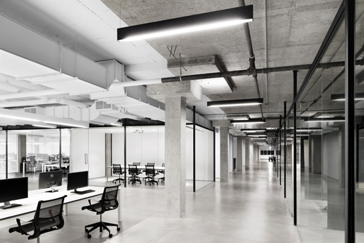
Huma Design seems to have accomplished with aplomb an ambience that breathes understated elegance and modernity in the interior architecture of the modern office space that they have chiselled for Ssense, a digital retail company. The office stands distinctly apart, a quiet, very strong statement of wealth, refinement, and at times mystery.
.jpg) |
| . |
An entire floor of a former textile factory is now
transformed into a modern office space, studio and warehouse. With Ssense being
both, creative and avant-garde in their use of digital retail, their mission
statement is precisely actualized by the colour, materiality and textural play
of the chosen palette.
 |
| . |
The new refined materials act in contrast to the
crude industrial shell. Inspired by the company’s graphic signature, a
minimalist black and white environment meets the visitor in the foreground. The
ceiling, walls, exposed column structure and even rusty pipes have been
retained a la artefacts, as a backdrop to the new architectural vision.
.jpg) |
| . |
Adhering to functional requirements, the office is
segregated into the mandatory conference area, meeting rooms and staff pool.
There are two distinct zones: the East side, with the common spaces including a
big laboratory kitchen, a play zone, a series of refectory tables and lounge
spaces; and the wide open West side, which is large enough for a hundred
employees, and hosts a dozen 12-foot long work tables. The white environment of
open desks is designed with a parallel movement of graphical, linear lighting,
effectively enhancing the space.
The division of spaces is interesting especially
since the spaces flow and ebb, meandering and breaking away from conventional
columnar or corridor-like monotony.
The spirit of the project stands as the link between
past and future. The concept is amplified in the connections and details
linking the new architectural elements to the original structure of the
building and the soul of the place. “We have designed a
space that reflects their personality - logical, efficient, transparent and
minimalist,” says Huma, principal and architect of the firm.

.jpg)
.jpg)
.jpg)
excellent concept of design!
ReplyDeleteLike the color combination,more spacious and organized elements
ReplyDelete