Info & Images: Courtesy Thomas
Balaban Architecte
Located in Quebec’s
up and coming Southwest neighbourhood, this 300 sq. m. detached house hides a
rich spatial complexity behind its tough working-class façade…
Turning to the neighbourhood’s
post-war veteran’s home as its formal point of departure, the architect firm Thomas
Balaban Architecte have set out to make a house that simultaneously fits in and
stands out from its heterogeneous context, without resorting to mimicry and
without sacrificing the contemporary nature of the project.
The principal
challenge lay in bringing light to the living spaces given the tight nature of
the plot and the availability of direct sunlight limited to its centre. By
flipping the traditional vertical hierarchy found in most two-storey homes, and
by carving out a series of spaces from the structure's volume, the project
addresses the need for exposure to direct light and the mandatory need for
privacy.
One of its most
striking features is the staggered central outdoor courtyard, created to funnel
light all the way down to the home’s lowest level. All the rooms have access to
this central space. Full-height windows at different levels provide a
theatrical quality to the courtyard space and maintain a feeling of being lived
in, with the homeowners aware of each other’s movement throughout the
house.
The spatial
transparency and open central nature of the courtyard allow for a deep
penetration of natural light and for efficient natural ventilation and movement
of air in the protected microclimate, contributing to passive solar energy.
Running parallel to the courtyard, the stacked staircases combined with a
north-facing opening at the top, provide a cooling chimney effect inside the house.
The house maximizes south-facing glazing for direct solar gain in winter, and
limits glazing on the north façade. The radiant concrete floors also serve as a
small thermal mass helping to mitigate exterior temperature fluctuations.
Externally, the house
is restrained, light and monochromatic, emphasizing overall form over
components and details. A standing-seam aluminium cladding in a natural colour
unifies the shape of the home, serving as both, roofing and wall cladding. Flat concrete panels painted to match the
colour of the metal cladding become subtle accents around doors and windows. In
contrast to the cool vertical surfaces, the many terraces are clad in warm Ipé
decking, highlighting the outdoor extensions of the living spaces.
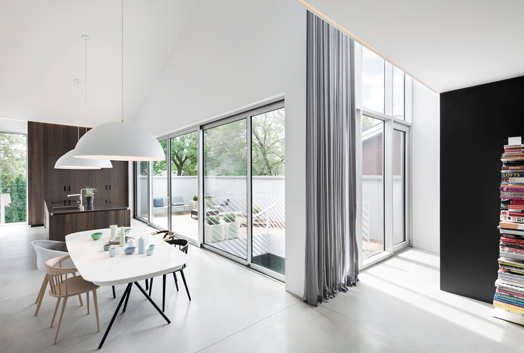
In sharp contrast to
the spatial complexity created by the central courtyard, the interior is also
kept uniform, strategically articulated with warm touches appearing in the
millwork and central stair. Pale, matt-polished concrete floors and
unarticulated white walls create the perfect backdrop for the homeowners’ collection
of art and design objects. The kitchen is simply organized around two elements
- the island and the storage wall– both constructed from the same material:
heat-treated white oak. The rich chocolate colour of the wood cuts itself out
from the white walls and pale grey floor.
Moments of contrasting exuberance are
also offered via the darker, graphic tones of the bathrooms and in the changing
vegetation visible through the windows, perforating the exterior of the house.
These architectural moments contribute to the house’s sense of theatricality. Fittingly,
the home is the recipient of the Residential Space 1,600-3,200 ft2 Award at
Québec's Grands Prix du Design 2014.

.jpg)
.jpg)
.jpg)
.jpg)
.jpg)

.jpg)
.jpg)
.jpg)
Very nice... airy,fresh,lots of natural light...forms and shapes are pleasing to the eye.
ReplyDeleteNot my style I suppose... needs some warmth... some natural woods & color... give me my jacket I'm cold! Like the glass & openness...
ReplyDeleteI like it, perfect combination of spaces and magnificent luminosity.
ReplyDeleteClean architecture! The minimal furnishing complement to exhume the inert beauty of the interior spaces.
ReplyDeleteThe space and the light are truly amazing, but .. Makes me feel cold
ReplyDeleteI presume there is just minimal furnishing and decoration just for the show of the space...
ReplyDeleteplace...
Beautiful . In some parts of Australia one would need to reduce the transparency because of the strong Australian sun . However would be great in Tasmanian State . However like Barry has commented . It needs some warmth . Thank you for sharing !
ReplyDeleteWonderful spaces! As an interior designer with a focus on environmental design and behavior, I see this work as a brilliant improvement on the cramped, dark house that this used to be. I would love to add to the magic of this house with art, sleek furniture, etc .
DeleteWow interesting Spatial Transparency & Spatial Complexity.......such nice article i like it images also so wonderful.
ReplyDelete