Compiled
by Udita Chaturvedi
Photography:
Zooey Braun; courtesy Ippolito Fleitz group
Elegant accentuation
and high-quality material coupled with sustainable construction help this
10-storey edifice in Frankfurt win the LEED Gold certification!
Away from the
conventional style of tall buildings in the German city is Solowest with its
high quality but subtle facade from the outside and a modern-day design
approach inside.
The 10-storey
building for official space built in Frankfurt in 1990 has been revitalized,
thanks to Phoenix Real Estate; where designers Ippolito Fleitz Group have
created an intriguing and dynamic interior in the access and supply cores.
The impressive
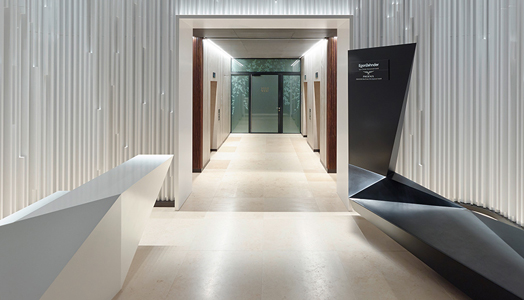
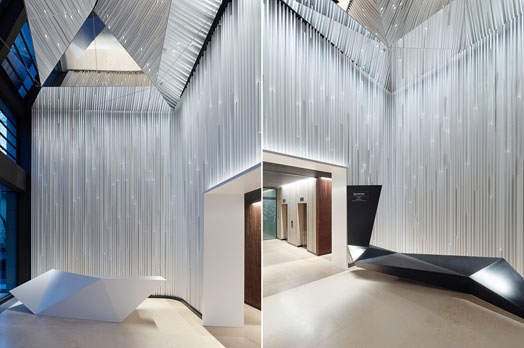
lobby serves as a shared business space for all the different tenants. The
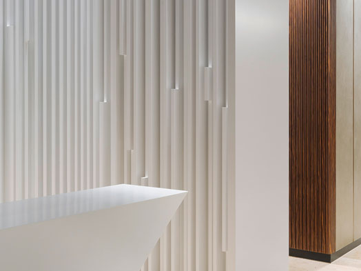
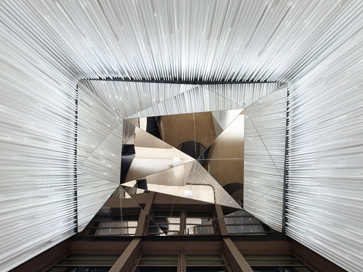
double height of the room is highlighted by a wall composed of vertical
lamellae that hang like shards of glass from the ceiling. Staggered at
irregular intervals, the vertical shards of the wall give a dynamic progression
to the room, while the concealed interstitial absorption fields ensure
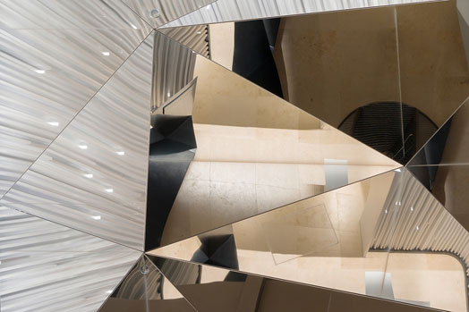
unexpectedly warm acoustics. Meanwhile, the ceiling is formed by a suspended,
polygonal, folded element of glossy, polished stainless steel, which further
elevates the height of the room through the reflection in the steel.
Placed between
the lamellae is the light source that illuminates the wall without being
visible to the visitors, making the walls “glow magically”.
Three abstract
but sculptural objects — a letterbox located in front of the building, an upholstered
seating element and a reception desk in black and white solid surfaces - in the
entrance area enhance the aesthetics of the ceiling, while the foyer provides an unrestricted view of the lifts, around which are located the access and
supply cores. The outer wall of the lift is panelled with walnut
veneer lamellar, giving the place the desired sophistication and warmth.
 |
| . |
“The overlap of the individual lamellae renders the doors to adjacent areas invisible, thus creating the impression of a homogenous, wooden corpus. A circumferential light strip further emphasizes its monolithic form. Here wooden pilaster strips run down the walls like veins, making the walls appear as cross-sections cut through the room,” explains the architect.
With the
revitalisation of this rather outmoded Frankfurt office block, Phoenix is
looking to appeal to a new group of clients. The modern-day foyer, a fresh
design and the continuous acoustic theme successfully make the building unique.


nice lobby design and materials construction
ReplyDeleteIt's beautiful. I wonder how well that wall treatment is going to stand up to dust and general wear.
ReplyDelete