Compiled by Pari Syal
Photography: Adrien Williams; courtesy the architect
Designed by Jean de Lessard creative designers, the Uniprix pharmacy on
the outskirts of Montreal, challenges accepted notions of generic pharmacy
typology…
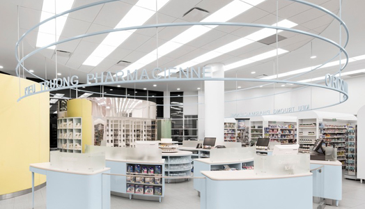
Designer Jean de Lessard is known for his radical experimentations! While conceptualizing this pharmacy, he was positive that he wanted the space to reflect the human side of the profession – “empathetic, simple and collective, unpretentious, allowing the pharmacists to be more accessible and be seen by their patients”.
To heighten the social dimension of the act, the designer chose to make
of the laboratory the focal point, and consequently, a place for socializing amongst
neighbours. The design is
modulated by some feng shui principles, such as organizing the
space to promote a smooth circulation of the energy flow (Ch’i) and
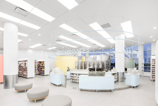
de-cluttering among others. It thus consists of a grouping of circles around
which one can walk, including a magisterial medicine side room and the
pharmacist’s favourite, an ergonomic pillbox, which she finds has a retro look.
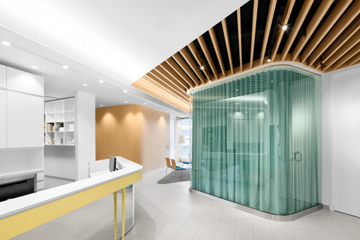
There is also a storage room and a circular glass air-lock looking office with
a sliding door, for private consultations.
For Ch’i activation, light is key and the laboratory is positioned in
the north, where soft natural light filters in from large windows. The colour
blue pervades this area reflecting soft light on the polished steel of the
pillbox – being associated in feng shui
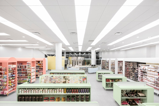
with water and metal elements. Similarly, furniture is also placed with taller
units towards the periphery and shorter units towards the centre.
A sense of movement and the rounded walls energize the place in a
non-aggressive manner. The round scheme is used for furniture, just as it was
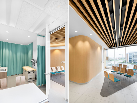
used in the pharmacy. The wooden slats ceiling of the waiting room in the south
part is another auspicious architectural detail. Wood brings structure, warmth
and brightness without oppressing the Ch’i. In feng shui, the south part benefits from the strong presence of the
wood element and is, by extension, beneficial to all of those present in the
space.
Simplifying spatial layout and dissociating the mercantile aspect of the
professional act of the pharmacist, “onus is on listening, professionalism and
human warmth instead of product”, concludes Jean de Lessard. Conveying fluidity
and openness to preserve the natural brightness, the immaculate walls are,
moreover, devoid of any advertising materials, leaving the space to harmony,
and contribute holistically to an improved wholesome customer experience.

No comments :
Post a Comment