By Rutvi Ashar
Photography: Courtesy Estúdio AMATAM
 |
| . |
Estúdio AMATAM draws out and uplifts the brand
identity of Tonik Health Club via smart use of colour and material, resulting
in a welcoming, refined and sophisticated environment...
Located in a modern building in premium Laranjeiras,
Lisbon, hitherto subjected to the lack of coherence, unwelcoming materials and a
humdrum environment has
its reception and foyer in particular spruced up to create a lasting first
impression on clients.
 |
| . |
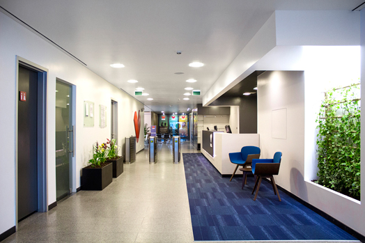
Beginning with the reception desk, by redesigning its
roof to create an elegant and distinguished atmosphere, emphasis is laid on customer service as a prime function
of the club.
 |
| . |
 |
| . |
Taking a cue from the shades of blue in the carpet, the
colour palette ranging from white-to-gray spectrum defines the area for customer service at the counter, highlights the
waiting area and further goes on to determine the circulation
flows.
 |
| . |
 |
| . |
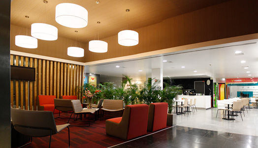
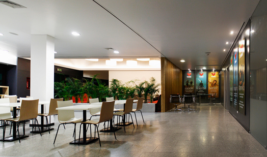
Following a thematic palette, other areas are
demarcated and chiselled to ambient environments: merchandising sales point for
the Tonik brand, memberships service area, cafeteria and
lounge.
 |
| . |
 |
| . |
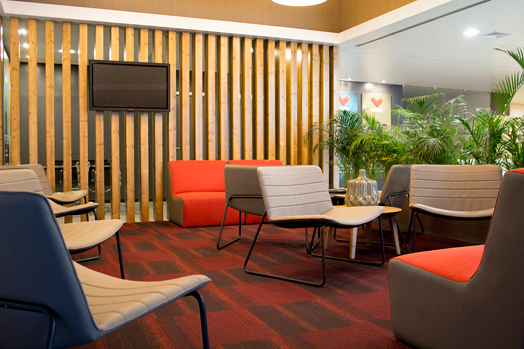
Open-plan, well-lit social spaces come alive not only because
of their unique spatial characteristics, which
impart an overall feel of comfort and refinement; but also with subtle
detailing in the use of various flooring materials, wallpapers and textures
coupled with exceptional furniture pieces, green wall feature and indoor potted
plants, etc that imbue tranquillity and harmony in the diverse spaces, despite
their peculiarities.

No comments :
Post a Comment