By Sonal Mamoowala
Photography: André Monteiro;
courtesy the designers
Read Time: 2 mins
 |
| . |
Brazilian designers
transform a compact space into an exceptionally vibrant studio apartment
playing with the most un-thought-of palette – black!
Breaking away from the
mould and experimenting in a totally uncanny manner takes a lot of gumption. Brazil-based
designers, Rômulo Teixeira and
Cintia Miyahira have set a
trend for modern youth to live with gay abandon, replacing tradition with trend
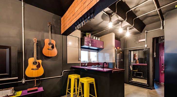
as they anoint a 34 sq. m. space with a black envelope - black walls, black ceiling, black
furniture, black fittings and accessories…
While this strikes you as
soon as you enter, the riot of colours that abound almost simultaneously
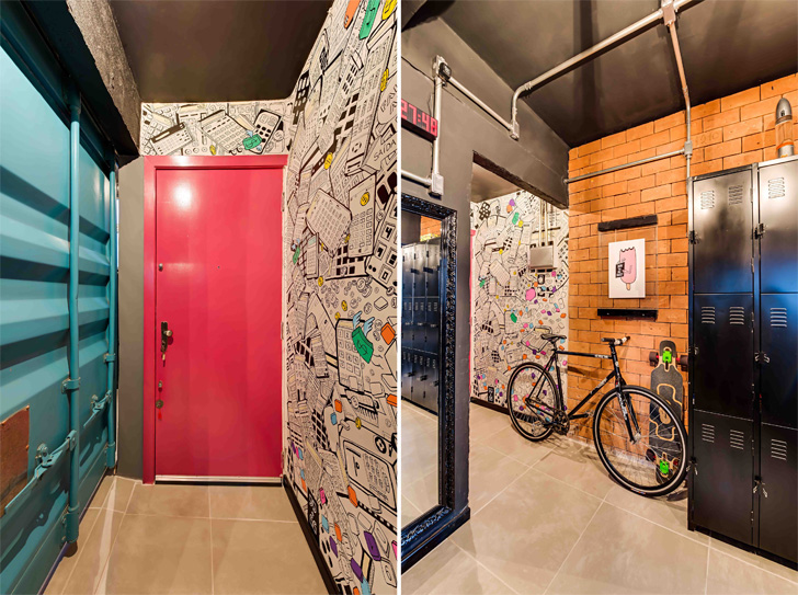
creates an amusing shift. From the pink entrance door to the blue and yellow
metal partitions; from magenta topped kitchen counter and cabinets to bright
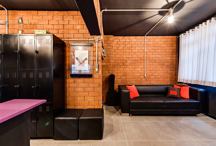
yellow stools and rust coloured exposed brick wall, every inch of space exudes
vibrancy. The neatly stacked clothes and shoes in the open wardrobe add colour
too.
Realigning space in a
one-room-kitchen apartment by breaking down walls and relocating the bathroom
at one end, the open-plan studio apartment serves as residence-cum-office premises. The designers adopt an
industrial grunge style, where well laid out electric conduits running across the
dark ceiling and walls, dormitory type locker storage units and a graffiti wall
depicting industrial waste, spring up as surprise décor elements.
Light plays a key role
dissipating the dark envelope, heightening an understated luxe element as
ceiling mounted lights cast interesting chiaroscuro elements, contributing to
the seemingly sparse arrangement. Versatility and feasibility of steel is exploited
to the maximum, creatively used in partitions and the multiple-use stool called
‘Malcom 37’, finished with coloured paint.
Besides a large space-saver
sofa that conveniently converts into a bed by night, and containers as a work desk
that can be expanded at will, the unique modular ‘Malcom 37’ singularly or in
multiples, ingenuously fulfills the role of seat, coffee table, side table,
shelving unit et al. The entire
scenario is beautifully balanced via a large mirror visually doubling space.
An amazing, thought-provoking paradise, reflecting one's personality… the design evokes a legitimate
response to… “Do we really need more?”


Great use of space! While black would not work for me, I think this is very unique and great place for a younger adult. How fun!
ReplyDeleteNice works
ReplyDeleteNice works
ReplyDeleteI say with a lot of passionate color
ReplyDeleteNot for me . Thanks. All the best .
ReplyDeleteThank you for sharing! It is far more than a black palette, and very daring.
ReplyDeletemiss a fireplace!
ReplyDeleteDefinitely works better in a large and light area. For some reason, Adrian Mole springs to mind.
ReplyDelete