IAnD Exclusive
Designer’s Personal Spaces
By Beverly Pereira
Photography of Interior Design: Bruno Almela
Photography of Branding: Luis Beltran; courtesy Masquespacio
Read Time: 2 mins
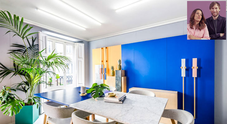 |
| The Masquespacio studio (inset) Principal Designers Ana Milena Hernández Palacios and Christophe Penasse |
The Masquespacio design studio is a study in the use of contrary yet harmonious palettes of both - colours and materials.
The Valencia-based multi-disciplinary studio has an unapologetically bold style that’s hard to miss. From standout spaces in the hospitality industry to instantly recognisable branding projects, Masquespacio’s effortlessly executed pastiche of the post-modern and the contemporary is a sight to behold and, undeniably, impossible to miss.
 |
| . |
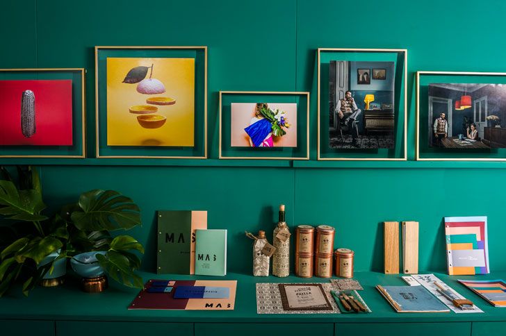
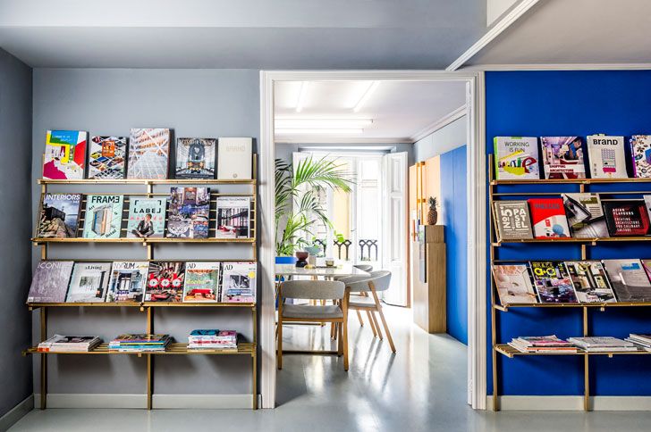
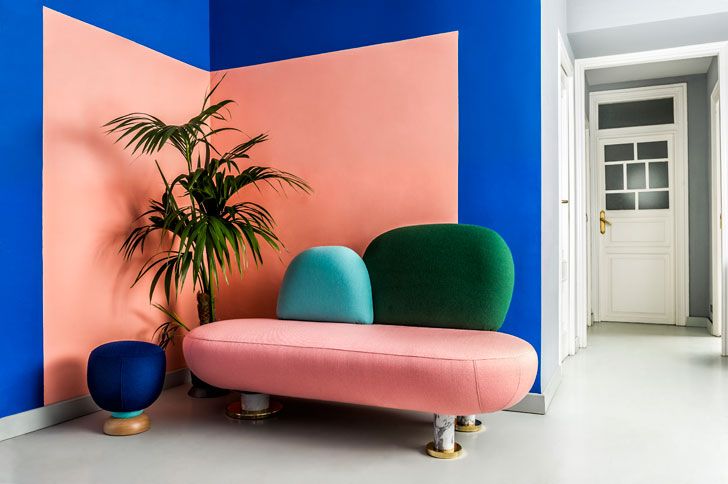
The studio’s colour blocked, Mondrian-esque walls in peach, electric blue, sunshine yellow and teal are the first obvious indication of the studio’s trademark style. Although the walls were previously in a bad condition, they’ve been recovered with painted wood, along with the ceilings.
The waiting room that doubles up as a casual meeting space is injected with vibrancy, thanks to furniture from their signature Toadstool collection. In true Masquespacio style, each piece fuses materials like gold-plated metal, marble and wood with upholstery in a range of combinations of solid colours. The adjacent space houses a larger meeting room, where precise geometry in the form of a teal square potter plays centrestage.
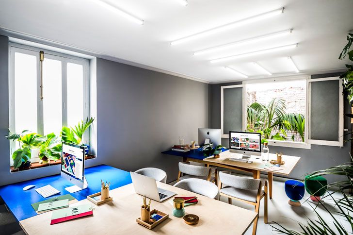
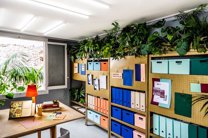
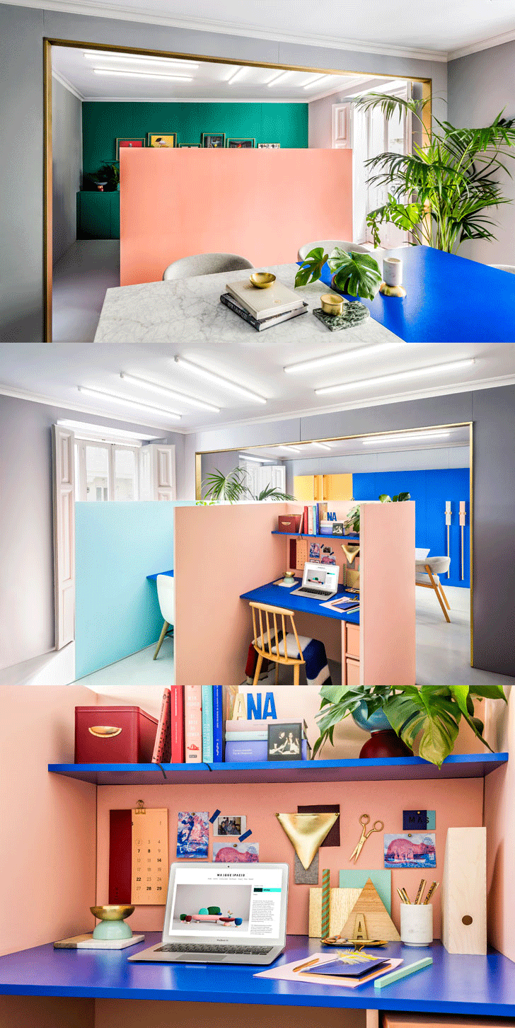
The senior designers occupy two individual cubes of contrasting colours, even as a strong visual identity stands out in colour blocked communal desks and filing cupboards on the upper level.
Tropical plants like Birds of Paradise flowers, Monstera Deliciosa, palms and other foliage fill this otherwise colourful and visually symmetrical space with an equally straight-forward dose of green.
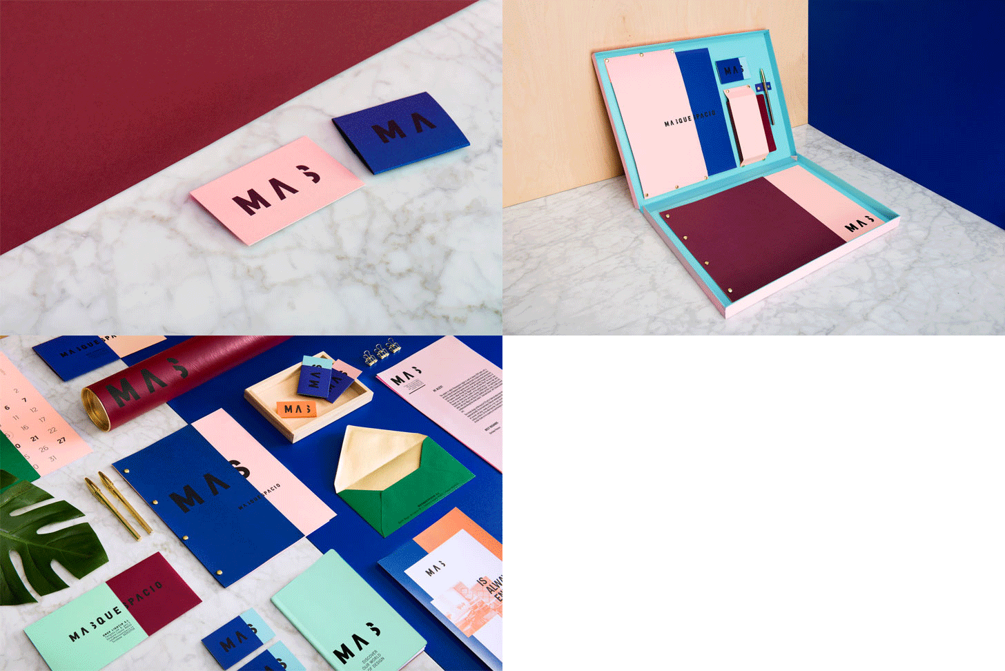
Masquespacio’s all-new brand image complements the studio revamp, reflecting its affinity for clean design, colour blocking and vivid colours. The latter ‘S’ in the icon ‘Mas’ that translates to ‘more’ in English divides the graphic application into two parts. Further, just like the studio’s customisable walls and partitions, the colours of its branding identity are adaptable on project basis. A true sign of the designers’ versatility and readiness to innovate.
The big two:
- An important design lesson that you abide by?
- You design what and how you are.
- Is there a message that you’d like to convey to your clients through your own space?
- We can adapt and go from one style to another. Our office has a strong trendy palette that mixes both low cost and luxury materials like plywood and marble.
Fact File:
Design Firm: Masquespacio
Principal Designers: Ana Milena Hernández Palacios and Christophe Penasse
Location: Valencia, Spain


No comments :
Post a Comment