By Vinita Wagh
Photography: Courtesy mimari studio
Read Time: 2 mins
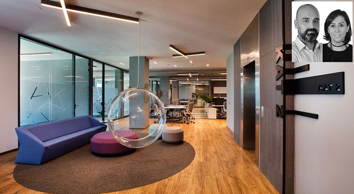 |
| ISPAK Headquarters, Istanbul (inset) Principal architects of mimari studio: Onder KUL and Ayca AKKAYA KUL |
mimaristudio’s animated design and perky interior lends personality to the 4500 sq. m. headquarters of Turkish packaging company, ISPAK Ambalaj in Istanbul, and leaves a colourful mark…
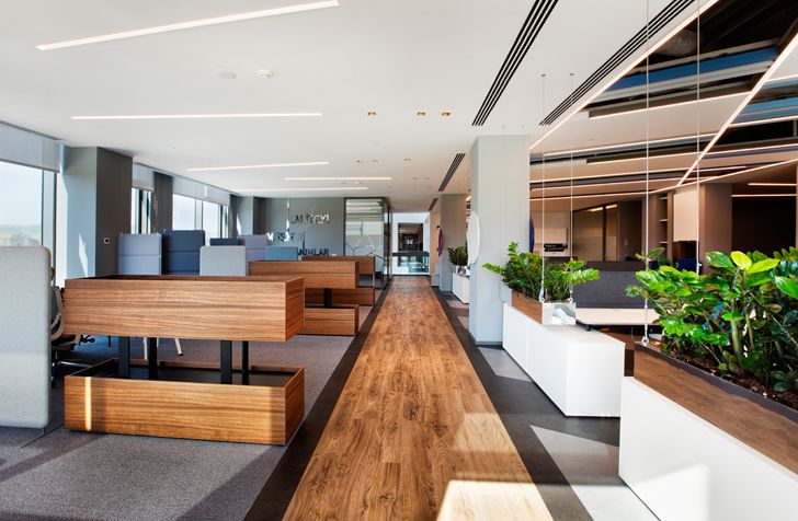
While the building design prioritises the comfort of the employees, the interior reflects the innovative and colourful image of the firm and helps shape the usage of different spaces. The design focuses on the association of social meeting points and working spaces to create a flexible, open environment, where spaces interact freely.
 |
| . |
 |
| . |
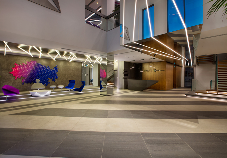
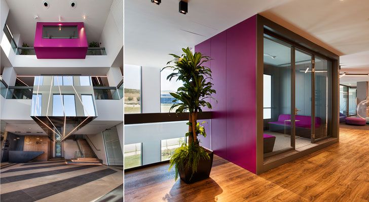
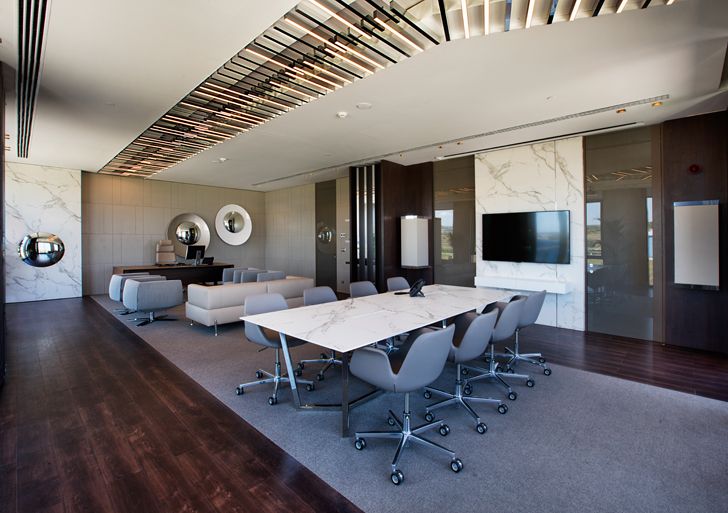
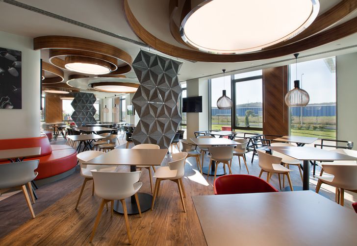
The four-storeyed building accommodates an entrance hall, a colour confirmation room, a meeting room, a laboratory, conference hall, cafeteria and gymnasium along with workspaces, admin offices, short meeting spots, private working areas and socializing spaces, all focussed around a central gallery space.
 |
| . |
 |
| . |
 |
| . |
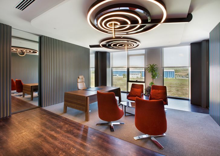
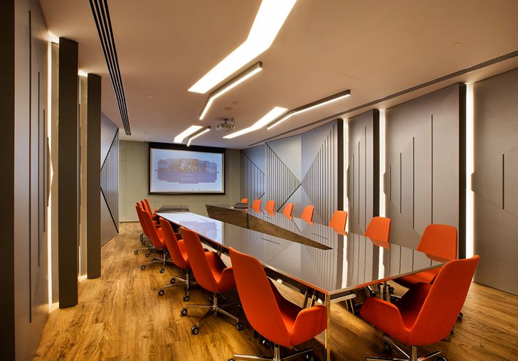
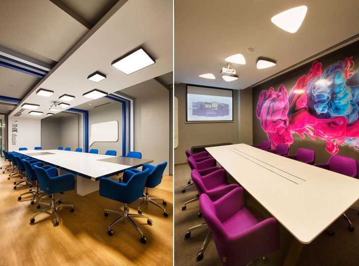
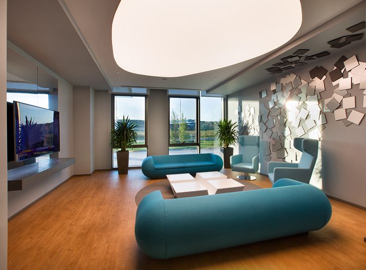
The interior comes alive in a dynamic fusion of colour and light. Distinct ambient hubs coalesce to constitute the work areas, generously interspersed with social hubs; bespoke material and finishes palettes ruling at all times. Custom furniture in different tones and styles predisposes the mindset into a more social acclimatisation rather than a generic work mode.
 |
| . |
 |
| . |
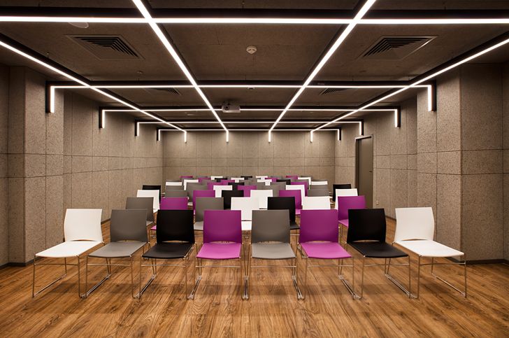
Hard floors use porcelain ceramics and epoxy finishing, while raised floors use modular carpets and loose lay. Seen throughout is the use of lacquered panels with flutes and edges along with painted glass and quartz panels, all well equipped with acoustic panels for optimum privacy. Though the walls are in tones of white and grey, decorative paints and wallpapers create interest.
 |
| . |
 |
| . |
 |
| . |
Enhancing these spaces is the choicest lighting – both decorative and functional, with lighting fixtures designed by Ayça Akkaya Kul. The use of linear lighting products in segmented ceiling patterns is striking. Manufactured in varying angles and lengths, the ceiling geometry informs the fixtures and lighting design. The studio collaborated with Dark Lighting for lighting design and Tenko for stretch ceiling work.
On the exterior, opaque and transparent surfaces on the façade cast an illusion of sorts as two floors appear as a single entity. The office encapsulates the corporate identity of the brand, creating experiential spaces, taking workplace culture to a new high.


No comments :
Post a Comment