By Teresa Simon
Photography: Diego Opazo; courtesy the architect
“A tasting room can help sell wine and build
brand/ product awareness.” Using this as the basic premise, architect Fran
Silvestre designs Vegamar, a wine shop, where both sales and tasting are paired
on the same footing.
Located in the main shopping district of Valencia
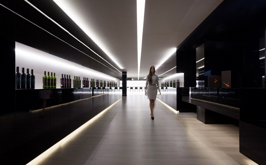
in Spain, the 12,300 sq.mt. project aims to convey the quality of the displayed
products, while it works simply and effectively on amplifying the space in
tandem with the experience.
A simple grid-like pattern is effected overall
with the alignment and straight lines of the furniture, the lighting and the
spatial layout. Dark, glossy panels are chosen for vertical surfaces and their
tone and reflections blur the spatial limits of the establishment, making it
seem much larger than it really is.
The colour of the material also reflects the
colour of the displayed wines. The vertical surfaces accommodate inbuilt
storage space and allow for a regularization of the available geometry.
The boutique store is visibly bifurcated into
the front display units, and has the wine bar and tasting ritual relegated
towards the back. Given that these are the only two functions that the
architect had to accomplish, Ar. Fran plays with lines and light, where
horizontal lines define the wine display and long recesses of fluorescent linear light on the
ceiling, are duly complemented with a mirror overhead that optically doubles
the perception of space.
.jpg) |
| . |
.jpg) |
| . |
Adding a touch of melancholy, akin to the variety of wine, dark flooring, black lacquer interspersed with white translucent panelling, a suspended ceiling and a series of glossy vs. matt surface finishes following a monochromatic vocabulary, realize a warm, non-intimidating ambience that could make a novice as comfortable as a wine connoisseur. A highlight is the subtle sense of sophistication via some clean-lined back-lit furniture.

.jpg)
.jpg)
.jpg)
.jpg)

We are Home Decorators in Bangalore and we have learnt many things from your post. We love your designs and your wonderful work. This post is very useful to us. Thanks a lot for posting your designs.
ReplyDeleteHey, very nice site. I came across this on Google, and I am stoked that I did. I will definitely be coming back here more often. Wish I could add to the conversation and bring a bit more to the table, but am just taking in as much info as I can at the moment. Thanks for sharing.
ReplyDelete