Compiled by Team IAnD
Photography: courtesy
SPARK
The
architecture, landscape and interiors of the new Prince’s Building make the
property a premier address for business and lifestyle in the lively Shekou district of South
China…
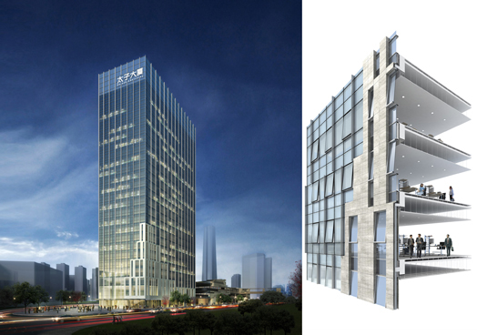
1100 sq.m. of
column-free flexible floor-plates with full digital connectivity meet the
demands of 21st century office users at this 27-storey office tower. The
71,600 sq.m. mixed-use development
and transportation hub for China merchants is also connected to five retail
pavilions via landscaped terraces that combine to create a unique naturally
ventilated retail and business destination. The buildings sit over and adjacent
to anew transportation hub that includes a bus terminal and the Sea-world
subway station.
 |
| . |
Prince’s
Building is located in an area of outstanding natural beauty, surrounded by
water on three sides, and mountains on the fourth – scenic layered hill-scape
that has also provided the inspiration for award-winning
international design studio, SPARK’s
design.
.jpg) |
| . |
.jpg) |
| . |
Each
office floor has full height glazing with spectacular ocean views over
Shenzhen bay with mountain views to the North.In order to enhance the elegance
of the tower’s proportions the glazed façade of the upper levels is accentuated
by slender aluminium louvres designed to catch the sun and lend a layered
shifting quality to the top of the towers. The tower’s base is connected to the
adjacent retail pavilions both, physically and materially at level three, where
the horizontal stone façade of the pavilions merges with the tower façade grid,
anchoring the tower and bringing visual continuity to the entire development.
The uppermost terrace is connected directly to the office tower at level three to
allow office users direct year-round weather protected access.
.jpg) |
| . |
At the
scale of the individual urban block, one’s experience is dominated by the five conjoined
retail pavilions: four pavilions clustered around the central courtyard and the
fifth - a lantern pavilion - at the heart of the triangular site.
.jpg) |
| . |
Clad in
horizontally layered strips of stone inspired by the rock strata of the adjacent
mountains, the architectural configuration lends the a human scale to the
project, allowing full integration of retail and advertising signage in synergy
with the architecture.
.gif) |
| . |
“It’s a
layered,open urban retail concept,” says Stephen Pimbley “that will create a
unique environment in which to shop, work and play.”

.jpg)
No comments :
Post a Comment