By Sarita Rupan
Photography: Courtesy the architects
The new Saw Swee Hock
Student centre for London School of Economics is a building that embodies
dynamism in the utmost form.
Designed by Ireland-based renowned
architects O’Donnell +Toumey, this landmark building is characterized by the
resilience and contrast in the architectural language followed in the existing
campus as it is amid the network of medieval streets of London, where it
stands.
.jpg) |
Planning Model_View from
Sheffield Street © Millennium Models
|
.jpg) |
Planning Model_View from Claremarket ©Milleneum Models
|
.jpg) |
| . |
Coming across as an
architectural puzzle, the folded, chamfered, canted and faceted façade is put
together with precise detailing using standard and custom-shaped bricks offset
from each other in a sculpturesque wrap around the irregular arrangement of
trapezoidal floor plates; and after careful study of site constraints, conforming
to the tenets of the Rights of Light Envelope.
.jpg) |
| Watercolour sketch ©ODT |
 |
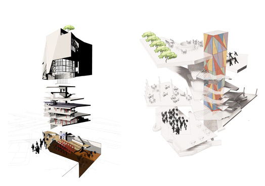
| Vertical Circulation_ Visual Connections ©ODT |
Even though the spaces are
carved with complex geometries, the movement inside the building is designed
with accessibility and inclusive design as key features. With approaches being
step-free and floor plate being flat, the circulation routes create vertical
and horizontal meeting spaces and lively interludes, rather than just being
modes of circulation.
.gif) |
| . |
Open-work steel trusses,
ribbed concrete slabs and solid wooden floor give a rustic feel to the
interior, with light weight partition and sliding screens adding flexibility to
the design. The spaces are allowed to flow into one another with the absence of
closed corridors making the street and the building act as one social and
sculptural entity.
.jpg) |
| Massing Model ©ODT |
.jpg) |
| Site plan - Concept sketch ©ODT |
.jpg) |
| . |
Sustainability performance being the key criteria, the design incorporates intricately woven solid and perforated surfaces, with large areas of transparent glazing for daylight consideration – a pivotal feature in the generation of the tapering building form (carefully tailored to reduce the impact of its volume on the lighting levels in the surrounding buildings - becoming narrower as it rises). The niches that push in provide shading to the wall planes and permit cross ventilation, while increasing walkway space on the ground. Natural untreated materials like timber joinery, hand-made bricks and zinc roofs referred from the Green Guide, are used to embody the dynamic architectural character. Added to this the building conforms to state-of-the art Low-Zero-Carbon-Technologies (LZC) – a bouquet of ingrained sustainability features that have won the design a BREEAM Outstanding rating.
After bagging a host of prestigious
awards (RIBA; RIAI best international award; Bricks –Supreme Award etc., etc.,
the project has recently been shortlisted for the coveted Mies Van der Rohe Award for European Architecture.

.jpg)
I had to look at this for a long time to form the words to express what I see. Basically, there are sections I respond to, and other part of the structure I recoil at. With utmost respect, it seems disjointed and too far-fetching for shapes and surfaces. Makes me dizzy. Like someone tried to be tooooo different. I appreciate you bringing this to share.
ReplyDelete