By Sarita Rupan
Photography: Ewout Huibers;
courtesy Concrete
Amsterdam-based
architecture firm Concrete, designs waterfront restaurant with an artisan
kitchen as inspiration, matching the chef’s renowned expertise with offbeat
decor…
Situated along
the scenic IJ waterfront in Westerdok Amsterdam, Nevel, as the restaurant is
called, forges a seamless connect with its surroundings in a dual dialogue -
one with nature as it opens via floor-to-ceiling clear glass walls to the
waterfront on one side and to the forest on the other; and with renowned chef
Ricardo van Ede’s artisan culinary skills that only uses seasonal and crude
products from land and sea.
.jpg) |
| . |
Every restaurant demands a signature in its ambience, an
identity that defines its style, and Nevel’s signature revolves around that of its
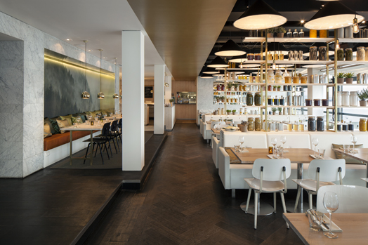
culinary expert. Flaunting the tools – jars, bottles of ingredients in white-washed oak wood open-shelving
with brass
inserts, filled with the chef’s signature Piccalilli and chutneys act as the highlight
of the eatery, forming its core attraction and acting as partitions with
seating integrated around.
.jpg) |
| . |
.jpg) |
| . |
While this forms
the open café ambience, private dining and the bar are set into niches to allow
privacy offering the guests a warm and homey feel with the added drama brought
in by large hanging fixtures in between subdued lighting.
.jpg) |
| . |
Taking a cue from the textures and flavours of the
ingredients, the colour and material palettes constitute light tones of stone clad facades, white
furniture with beige upholstery and drapes infixed in between natural wood
floors and a dark ceiling – creating a neutral envelope for the busy ambience
to play upon. The inviting flow of natural light and panoramic views augments
the airy and fresh aura, capturing the essence of gourmet dining.

.jpg)

.jpg)
Looks like IKEA.
ReplyDeleteI like the forest wall mural at the entry.
ReplyDeleteAaaah.... what a refreshing ,spacious,clean view to my eyes...very nice décor and colours..
ReplyDeleteI only didn't like the menu which are hanging on the wall (if I am not mistaking !)
It reminds me of horses somehow !! or stalls for that matter !
From an elegant view they take to somewhere else which I didn't like...
otherwise the décor is beautiful with everything in it...