By Pari Syal
Photography: David
Rodríguez y Carlos Huecas;courtesy the
 |
| . |
Award-winning Spanish creative
consultancy, Masquespacio has recently reworked on the brand image and
interiors of Acadèmia Altimira - a school that specializes in recitation and
English classes.
Bearing in mind the small footprint
- just 123 sq. m. – the designers focus on the targeted clientele - kids,
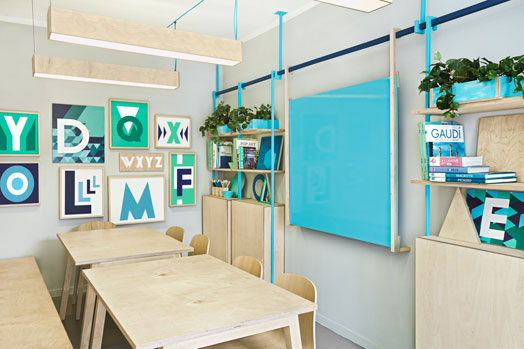
teenagers and young adults to design a young and energizing blue-green
environment that spells flexibility and fun.
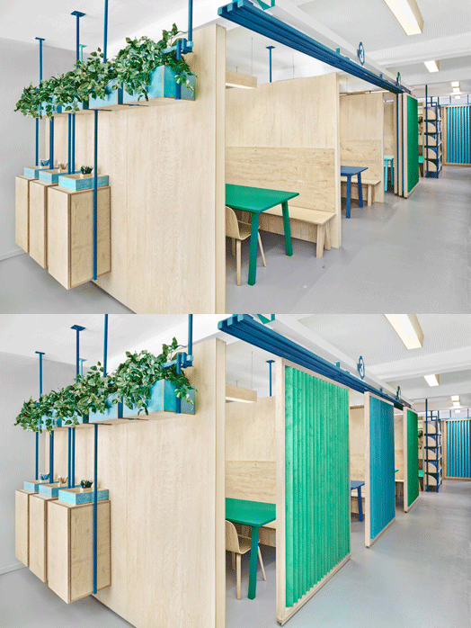
Using the underlying principles of
‘constructing’ oneself through learning, an open layout is adopted, where
classrooms are cordoned off with three-quarter height plywood walls that also
act as acoustic panels. Sliding doors made of wood strips meanwhile allow
closing the classrooms at any time, without losing the light entering from the
corridor.
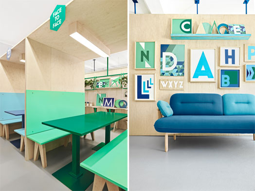
The little place adds a
distinctively personal touch through a ‘Face-to-Face’ zone that facilitates
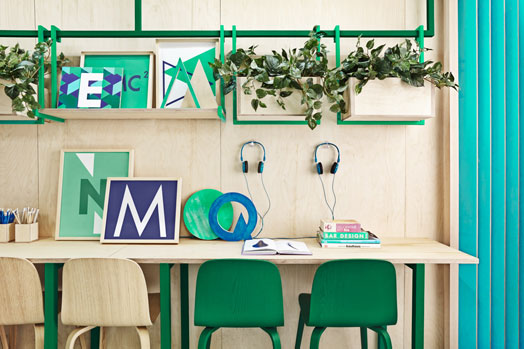
one-to-one classes for the students, besides a study area that maintains the
aesthetic lines of the academy defined from the entrance to the final
classroom.
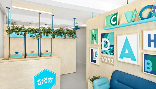
The two-colour palette balanced
with the neutrality of light beige brings alive the small space without much
ado. Besides some planters and a media-wall kind of display of letters, there
is no clutter. In terms of design too, the slim blue rods constitute furniture
supports and together with the floating ceiling, enhance the volume of the
space.
After different international
projects, Masquespacio adds this, its first project in Barcelona to its
portfolio through a design that represents its most trendy image. Combining
the two disciplines of their founders, interior design and marketing, the
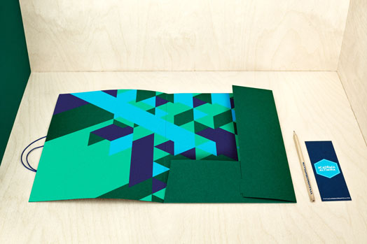
design agency has also reworked on the branding for the academy, giving it a
fillip, using hexagonal building blocks as symbols of growth and saying it up
front – ‘Build Yourself’!


ReplyDeleteSo wonderful
Very nicely done! Working for a Design and Branding firm, we completely get it.
ReplyDelete