Compiled by Team IAnD
Photography: Courtesy the architects
 |
| . |
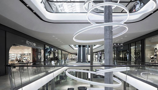
A step into Ippolito Fleitz Group’s ambitious new urban development Das Gerber, a shopping mall in Stuttgart, Germany, carries you right into a futuristic dimension…
A competition win – Das
Gerber as a key location and leading city address has its building designed by
architectural firm Bernd Albers Berlin, and its interiors and signage chiseled
by the Ippolito Fleitz Group.
Comprising retail, office
and residential spaces, keys facets of Das Gerber are its high quality
environment, easy orientation and spatial elements with a strong recognition
value.
Entrances at three of the
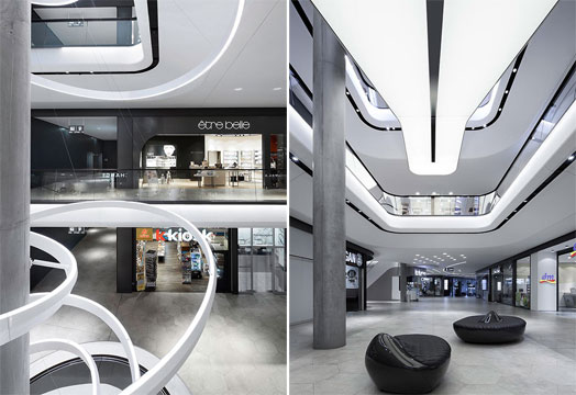
four corners of the building aid easy access to the neighbourhood. Inside,
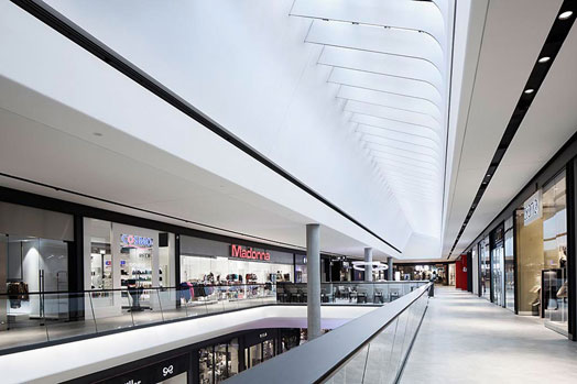
rounded ceilings and balustrades create fluidity and accentuate its
verticality. Incised airspaces create visual links between the different
levels, while glass sides make the ceiling layers appear less weighty,
revealing shop façades and keeping shoppers engaged.
A monochrome note of
elegance via a continuous, warm dark grey façade screen mitigates visual
competition amongst individual shop façades sustaining a cohesive look and feel
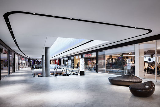
– especially adhered to by stringent guidelines. Black light channels set into
the ceiling and dark wooden hand rails support this effect by circumscribing
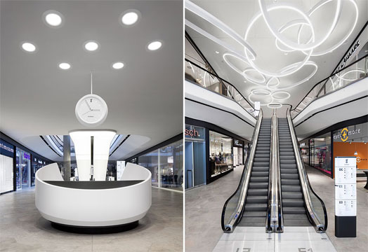
spatial apertures. The play of black lines is completed in a dark strip running
down the back of the backlit escalators; each escalator serving as a striking
light object and an important horizontal orientation point.
Simply and beautifully, a
hexagonal tile reflects the pavements in the surrounding urban environment, and
continues into the interiors of the mall, inviting one to tarry and browse,
while still clearly denoting the route. The shape of the floor tiles recurs in
the ceiling design, where they are tilted and offset to form relief accents.
Two elements of design
particularly stand out – the three different sizes of seating islands and the
central circular light fitting. The former are designed to be inviting while at
the same time restricting resting time, as well as proving suitable to all age
groups; and they accomplish this with their flexible size and organic shapes. These
also accentuate the sophisticated mall interior and make the dynamic spatial
geometry of the architecture visible and tangible to visitors.
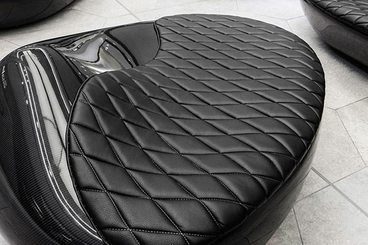
Made out of carbon fibre
reinforced plastic (CFRP), the lightweight seats have organic contours and a reflective
surface. 3D machined moulding, hand-laminated carbon mats and hand-sewn leather
cushions go to make up the unique nature of these seating islands, which pay
homage to a luxury-car-loving target group in the motor city of Stuttgart.
 |
| . |
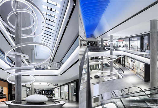
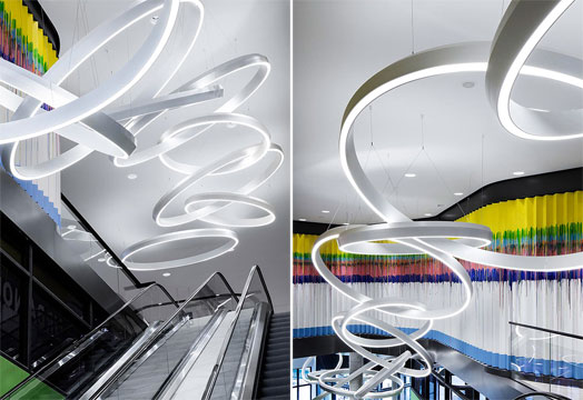
The second design highlight
is the central element of the interior identity - the light rings, whose shape
echoes the Gerber logo – a letter ‘g’ constructed from two circles.

I would be glad if all WebPages provided such type of best articles.
ReplyDelete