IAnD Exclusive
By Savitha Hira
Photography: Courtesy
Balmond Studio
Read Time: 3 mins
 |
| Waterfront ,Sri Lanka |
International
architecture + design practice Balmond Studio engages in an elaborate
rebranding exercise! IAnD in conversation with Creative Director James
Balmond...
Led by the world’s leading thinker on form and
structure, Cecil
Balmond, the international
research-led practice of architects, designers, artists and theoreticians has
worked on establishing a standardization procedure spanning the complete
spectrum of communication, across all their offices from Europe to South East
Asia.
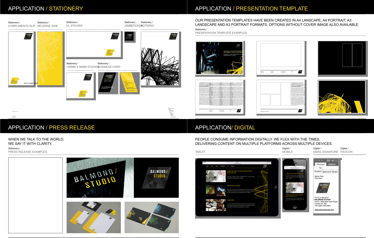
From the logo, visiting
cards and stationery, down to standard presentation templates, file naming
protocols and digital experience, the studio that is renowned for its dynamic
architecture that “engages with inner organizational systems such as algorithms and fractals”,
now conveys the essence of its work motto, philosophy, methodology and values
with aplomb.
IAnD in
conversation with Creative Director James Balmond...
IAnD: What was lacking in the old identity?
JB: To be perfectly frank, an actual identity. The old logo was
simply the Aksidenz Grotesk BQ Condensed typeface. It wasn't unique, own-able,
and individual. There was no real illustration of the Balmond Studio design
methodology, values and aesthetic. This
had to be conveyed through the new brand for both staff and the wider
industry/clients.
IAnD: What were the new considerations and how were they incorporated into
the new identity?
JB: Firstly, the brand had to reflect the way we design and the techniques we
use – in both, architectural and artistic creative processes. The second factor was all about putting the
concept of change first. Change Dimension is the new brand expression driving
everything we do. To ‘change dimension’ is to make a positive, to alter the way
of things at any time on any scale, creating new horizons and experiences.
From a branding
perspective, this represented a real challenge. Traditionally branding look and
feel is fixed, static - inert. We had to create a look and feel that was,
dynamic, energetic - something
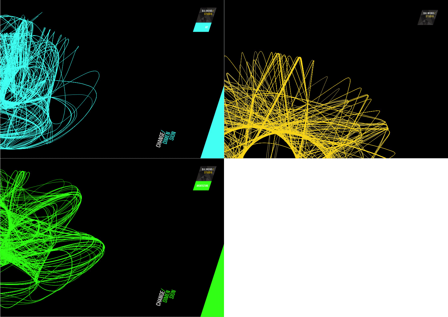
with infinite iterations. So we introduced the algorithm - we have
developed a graphic based on the classic Klein bottle algorithm. It has a
never-ending series of forms, so we can create a unique algorithmic imprint for
every piece of communication if we want to. But as each iteration comes from
the same algorithmic function, there is an overall branded consistency too. It’s
a unique device that stays true to our change dimension philosophy.
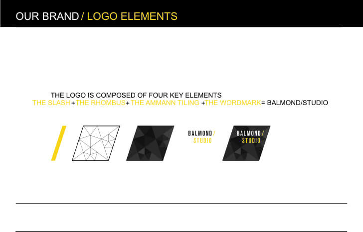
Also the 'slash' is
a symbol of change. It is another symbol that signifies the changing elements
of our business. So there's Balmond/Studio, Balmond/Publishing Balmond/Real
Estate etc.
IAnD: How important is it for
a company to re-affirm its identity?
JB: It's extremely important. To look at this simply, how can I
feel a connection and proximity to the company I work for if I have an unclear
idea regarding what they are all about? Re-affirming our brand identity means
that we fly the flag with clarity - that way everyone can identify with us and
what we stand for. And this creates cohesion - keeping everyone on the same
page even though they are working in different parts of the world.
Society
evolves, technology grows, the industry changes. A brand must change in some
ways too to reflect these factors. Re-affirming brand identity creates
relevancy and synergy with the cultural zeitgeist.
IAnD: When is the right time for a brand re-shuffle? How does a firm
know that it's the right time for a new look?
JB: This will vary from organization to organization. For us it
was about rapid growth. New people joining all over the world. We had to ensure
they knew who they are working for, how we do things and what we expect from
them. The brand inspires and energizes staff - so it is vital.
If one
can sense a malaise amongst the staff or a lack of passion for the company,
then it is time for a re-brand to energize people. Also if client/industry
feedback highlights a certain amount of issues with the messaging/imagery/brand,
then it could be time to consider changing things brand-wise and fixing these
problems.
IAnD: How do you propose to roll this out - phase-wise? What else?
JB: This is the soft launch. We will ensure synergy across all our
platforms and printed/digital communications.
Phase 2
- we will push the 'Change Dimension' thought to the world. To do this, we
have created a special piece of communication that has never been done before.
It is a real game changer. At the same time, we will take a specific action in
the wider world, conveying the Change Dimension thought, whilst simultaneously
trying to change the lives/culture/ mentality of a population or community. We
will show how change can be a positive force using art/design/aesthetics. We
then plan to crowd-source the idea, getting inputs from people about what they
feel about the idea - creating bespoke human content.
IAnD: When Balmond Studio was set up in
2011, the Balmond name was
a powerful brand in itself. Consequently
the initial 'branding' was perceived from a functional and practical
perspective. Stupendous growth has
necessitated the establishment of a brand DNA.
The black (bold, powerful, classic) and yellow (positive, light, warm) letters
against a seemingly diamond-like backdrop is in fact the culmination of a
meticulously thought-out synergy of everything that Cecil Balmond and his name
tag represents – to the extent that the new brand vocab even streamlines
Balmond Studio’s tone of voice with invaluable attributes like clarity,
brevity, humanity, simplicity and above all poetry and extra-ordinariness that
are a potent hallmark of the design practice.


No comments :
Post a Comment