Compiled
by Savitha Hira
Photography: Zooey
Braun; courtesy Ippolito
Fleitz Group
Read
Time: 2 mins
With the Black Forest in south-western Germany as the driving muse,
retail outlet Drubba Village scores high on its aesthetic interiors...
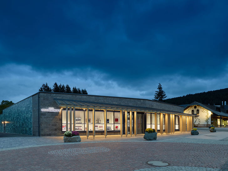
The idyllic lake-side positioned Titisee-Neustadt is a small peaceful town in the romantic
Black Forest, buzzing with Asian visitors, who throng to Drubba Moments – a
boutique outlet specialising in the sale of cuckoo clocks and high-end
wristwatches.
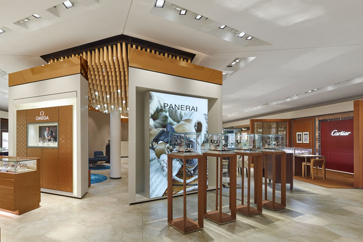
Recently relocated, it has been designed by Stuttgart-based multidisciplinary
design studio, Ippolito Fleitz Group, with a focus on creating a concentrated shopping experience, where individual brands
can maintain their identities amidst a unified spatial concept.
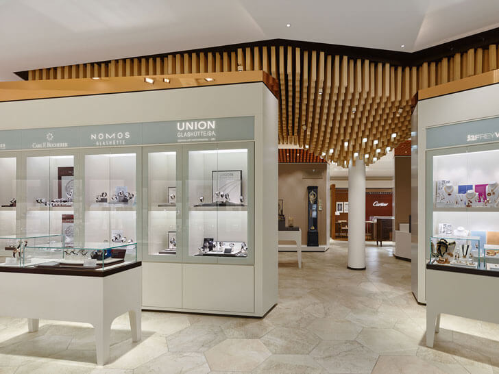
To enable brands maintain their distinct corporate architecture, the
design of the branded spaces is governed by few distinguishing parameters: Wall niches define the framework and provide
a unified rhythm. The floor is executed inlarge-format, porcelain stoneware
tiles, creating a restrained background for brand presentation, while their
hexagonal form cleverly resolves the polygonal layout of the space. The subtle
tile colour means that the outer ring of the space steps back, allowing the
brands themselves to take centre stage.
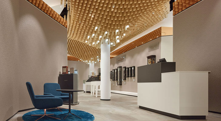
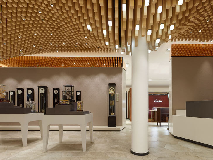
And the centre-stage here is a curated core area, where a café/bar and
watchmaker service are located, and mechanical masterpieces and high-quality
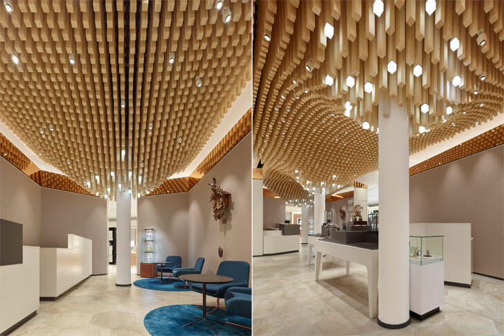
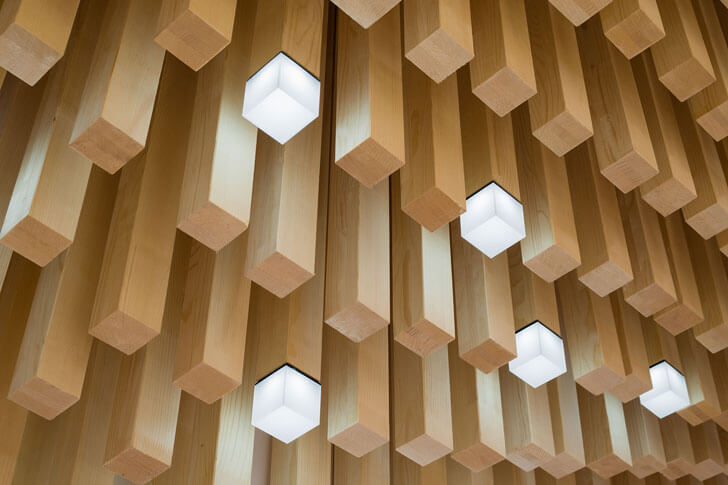
clocks are displayed and sold. The space has a special character with an
eye-catching ceiling comprising 4362 spruce rods, stretching across the core
area in undulating waves. Natural hues dominate referencing the surrounding
Black Forest as dark metallic tones anoint the upper sections of the display
tables and dark faux leather anoints the upper parts of the counter. With
subtle elegance and a gentle dose of theatrics, the central space is
transformed into a visual attraction without stealing the show from the
surrounding branded areas.
A key challenge in the project has been of the lighting design, which ensures
that products appear in the same light even when taken out of the display cases!

Thanks for posting this info. I just want to let you know that I just check out your site and I find it very interesting and informative. I can't wait to read lots of your posts.
ReplyDeleteThank you Mr. Crocker. Hoping to bring you more informative and engaging stories.
Delete