By Annie Aggarwal with inputs from Avinash Yadav
Photography: Luca Morandini; courtesy the architect
Read Time: 2 mins
Studio Apostoli lives up to its reputation of
cutting-edge design by crafting out a sportswear flagship, ‘Just Play’ with its finger on the pulse
of an urbane techno-savvy clientele…
Recently
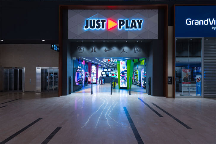
inaugurated at the brand new Adigeo Shopping Centre in Verona, Italy, and designed
by Ar. Alberto Apostoli, post extensive market research and user study, ‘Just Play’ is a space that its target
customers - youngsters aged four to fourteen can truly identify with.
In collaboration
with Nike Inc. and holding Nike, Converse, Hurley and Jordan brands, ‘Just
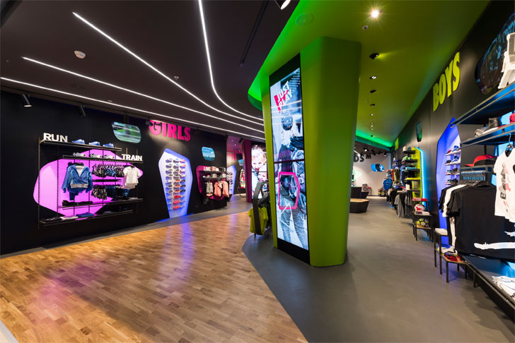
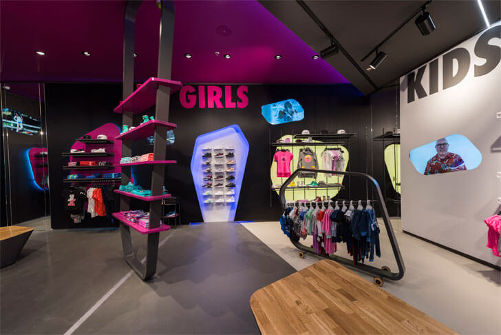
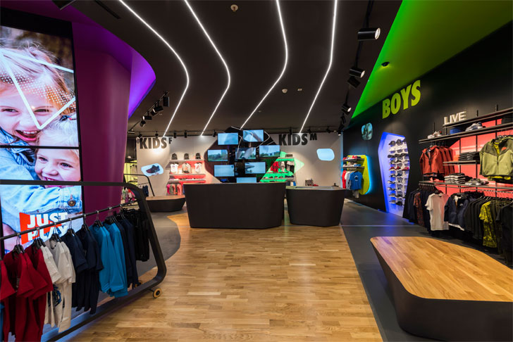
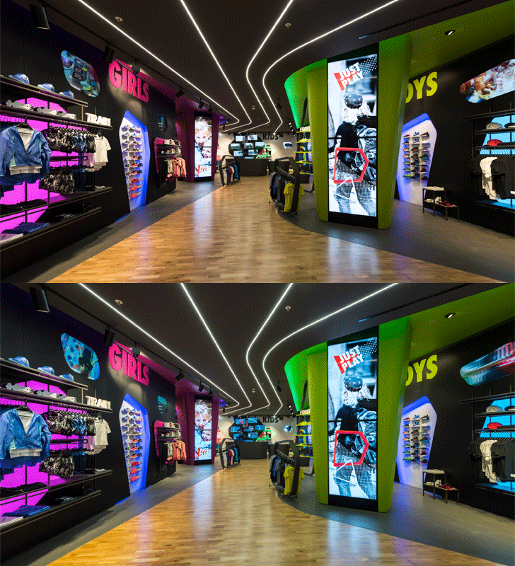
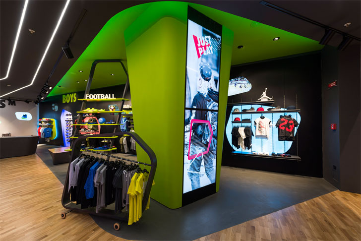
Play’ instantaneously captures young minds with bright green and fuchsia pillars
on the sides of a central, subtly meandering path. These prismatic totems
feature recessed video walls composed of 16 screens and breach into the ceiling
providing clear-cut theming.
 |
| . |
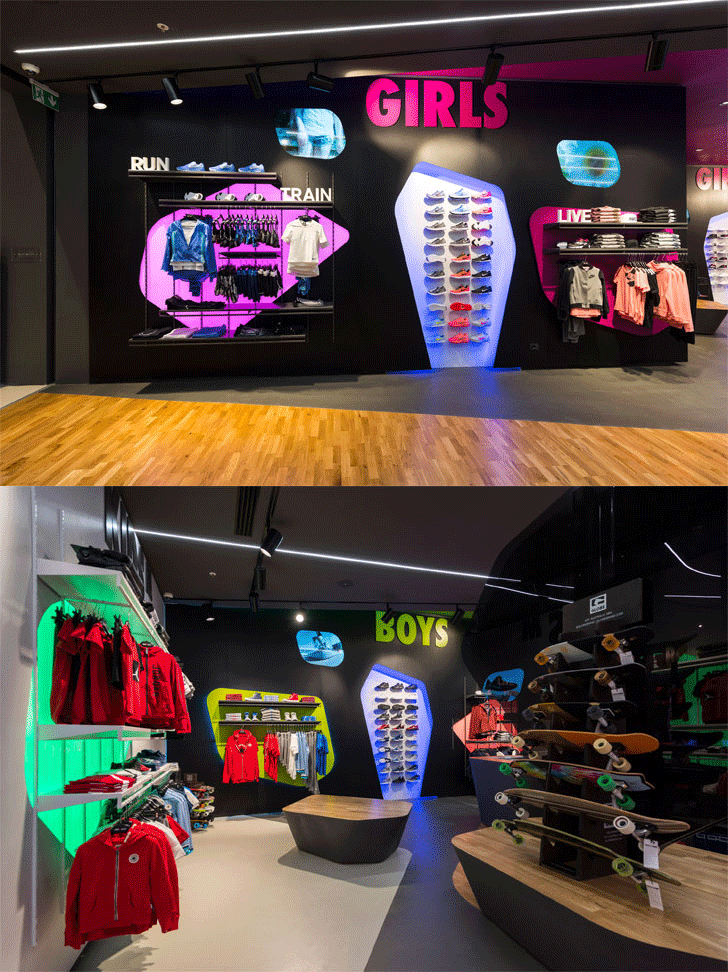
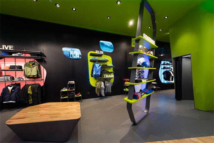
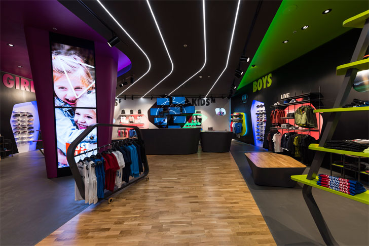
Areas divided
based on gender, age group and corners to feature the four brands, all follow a
consistent language of fluid, irregular shapes throughout. Product display is
highlighted along the walls and via custom-designed freestanding shelves and
hangers, in brightly coloured metal, Plexiglass and lacquered wood; the forms
reminiscent of sports equipment like skateboards, etc. Island units in wood and
metal continue the irregular geometry in a volumetric dimension, whilst bright
bold lines on the ceiling reminiscent of an athletic track define the subtle
reflect to a sports-thematic. The floor, partly wood with basketball court
markings referencing parquet gyms and partly resin with an effect of ‘street’,
completes the store.
 |
| . |
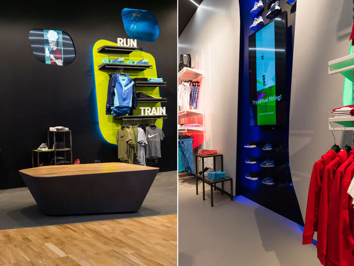
Lighting augments
the feeling for both parents and children. RGB fixtures with Digital
Addressable Lighting Interface (DALI) caters to pre-programmed scenarios:
parents in the morning with soft, smooth light; while children in the afternoon
and on weekends are greeted with impactful, dynamic lights and colours.
 |
| . |
 |
| . |
Technology
furthers the experience, offering maximum connectivity and interaction. A
multimedia tree (the hub) at the entrance displays all the products on sale,
offers feedback and contact with store community. Tablets provide a guided,
tailor-made shopping experience based on customer preferences, much like a real
browser; through the store lined with recessed wall screens, and virtual
mirrors that contain a library of 3D garments, also available on display,
making them appear as if the user had them on; models and colours changeable
with a click. The whole experience shareable on social media makes the shopping
experience more rewarding and allows integration with the online store.
 |
| . |
 |
| . |
The design goes beyond point of sale approach, and employs marketing and communication strategy in an ambitious and innovative play of elements to create a store that enhances play for its young customers; the concept already set to expand nationwide and beyond.

No comments :
Post a Comment