By Shrabana Das
Photography: James
Chan; courtesy the architect
Read Time: 2 mins
RIGI Design transforms a retail store into
a real-life magazine through innovative zoning and a non-intrusive colour
palette…
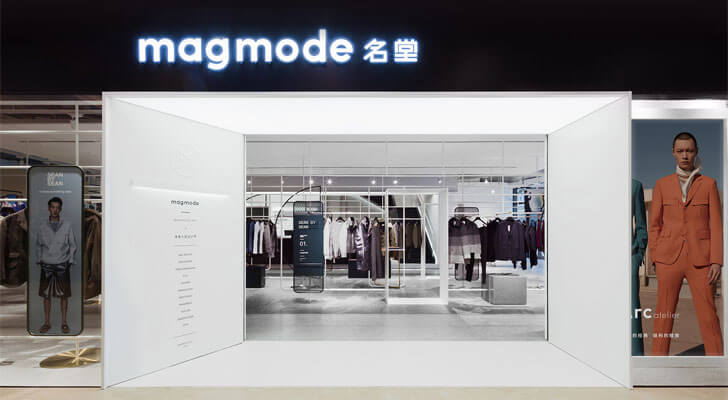
Picture this: A Page of Contents greets you
at the entrance; instead of a traditional signage, it is a picture of a brand
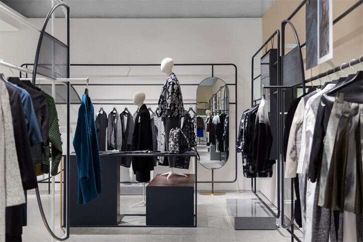
splashed across the display window. You enter to find the various areas styled
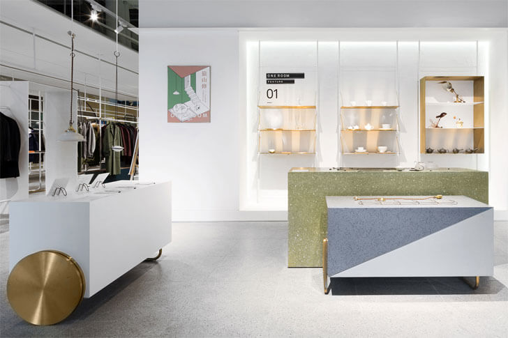
like different sections of a magazine – each section being a ‘page’ of display!
Magmode is an innovative combination of
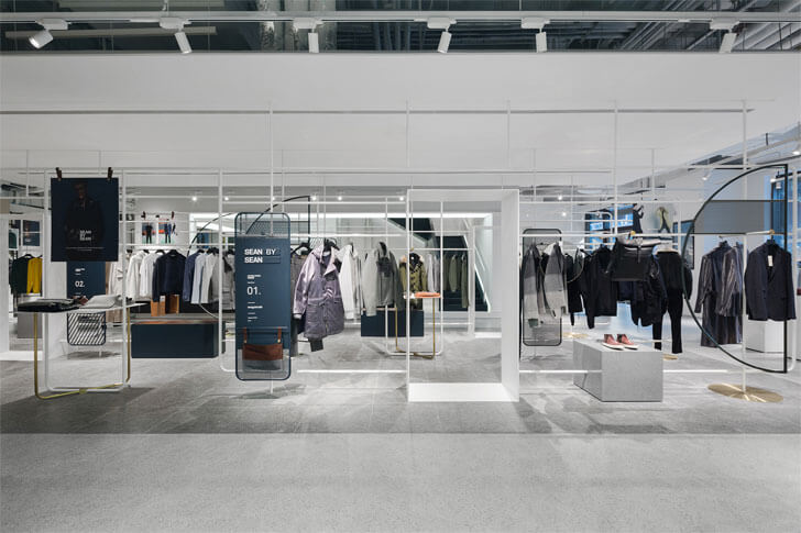
zoning and imagination, the theme being a magazine. You begin by browsing
through the season’s latest collections and are directed towards each ‘page’ of
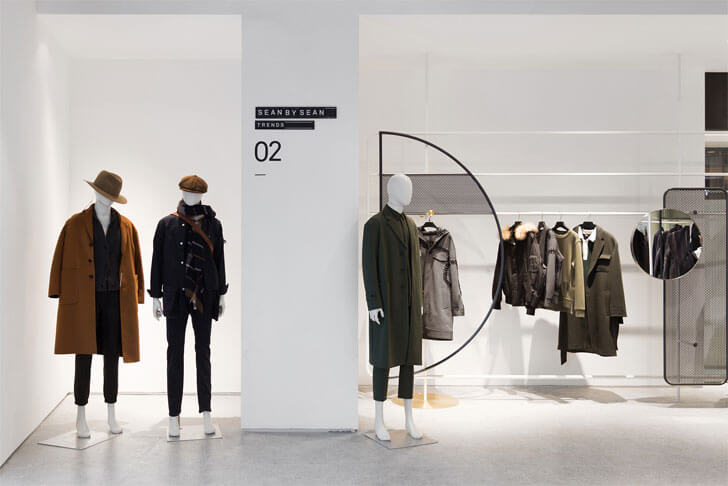
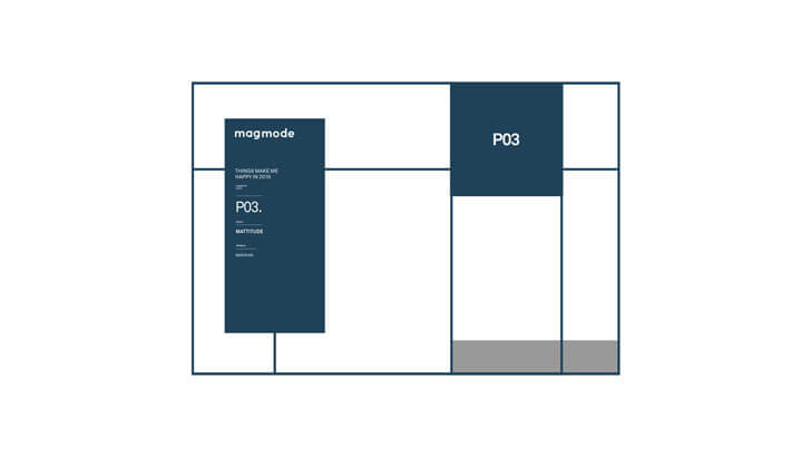
display, beckoning your attention. Each display area features a brand, which
comes with a brief seasonal introduction as the design of its pin-up.
The dynamism of a space as conventional as
a retail store is achieved perfectly by Liu Kai, chief designer of RIGI Design.
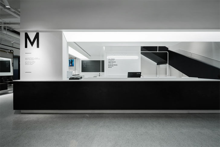
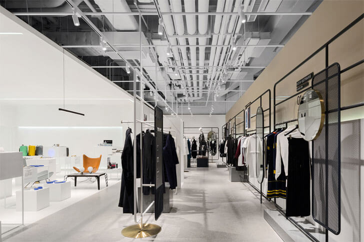
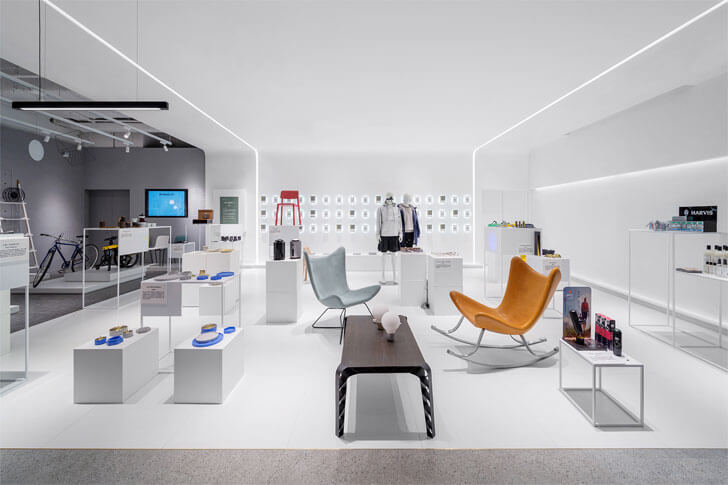
The neutral shades on the walls accentuated by white indirect lighting along
with mounted blocks for display ensure that the composition of the space is
governed entirely by the products on display and the background introduction. The
store features top fashion labels, lifestyle accessories and books.
Each section displays the family of
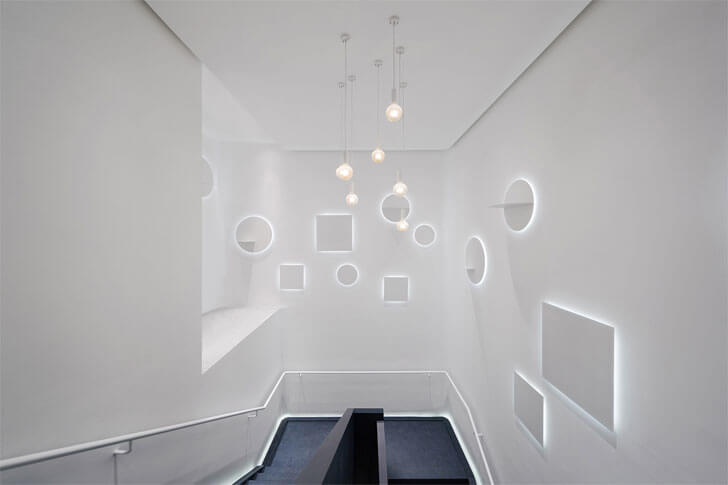
products by the brand. The only space, where the designers allow themselves
some relaxation from the neutrality, is in common spaces such as the staircase,
which boasts of a minimalist yet enchanting lighting statement.
There are certain interesting quirks such
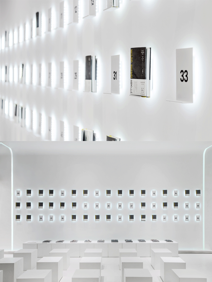
as the display of a single book in one ‘page’ as it is the book of the season.
Or perhaps a complete set of attire and accessories as per the ensemble aspired
for by the brand wagon; with a mirror for you to see yourself instead of the
models that you may go starry-eyed at, in magazines.
You can never walk out of the store
expecting to see the same interiors next time. For the latest issue of Magmode
is already out and running!
Fact File:
Project: Magmode
of Hangzhou Kerry Centre Store
Designer: RIGI
Design
Chief Designer:
Liu Kai
Area: 600 sq. m.
Location: Hangzhou,
China


No comments :
Post a Comment