By PariSyal
Photography: Pierre
Bélanger; courtesy Philippe Dubuc
 |
| . |
The notion that
art is largely viewed as an aesthetic component, an add-on is fast changing. The new Philippe
Dubuc retail in Montreal has a life-size art installation closely nuancing his
signature style…
Art
installations are being increasingly viewed and accepted into mainstream
thought processes for their metaphoric and analogical contributions to
lifestyle, mindsets, cultural connotations and society at large.
.jpg) |
| . |
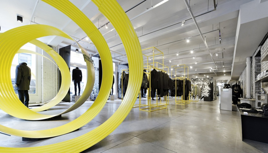
‘Close Up’ is a
striking large installation by landscape architect (and president of the
architectural firm B3), Sébastien Breton that integrates seamlessly into the
Saint-Pierre Street boutique in Montreal, Canada and beautifully complements
the collections of fashion maestro Philippe Dubuc.
 |
| . |
The simple but
overpowering installation symbolizes absolute urbanity, dynamism and is the
perfect foil to the textural nuances that Philippe’s latest collection epitomises.
It appears as the highlight of the store; its surprisingly playful overtures
making it appear as if in constant motion.
“I like to draw
upon change and contemporary art for inspiration,” explains Philippe Dubuc.
“Sébastien’s installation, the second that we have had the good fortune to
host, is a playful and ephemeral work that blends easily with the designs, and
also leads the observer elsewhere.” ‘Close up’ is beautifully complemented by
artist Zilon’s murals that not only serve as a shining tribute to Philippe's creative bent, but also mirror the rebellious flair that the designer is known
to bestow so expertly upon classic menswear.
.jpg) |
| . |
Comprising of
segments of an immense galvanized steel culvert from Soleno, and cut and painted
bright yellow on the inside, the segments are positioned to create a concentric
effect that brings to mind the name of the piece itself – ‘Close up’. From the
street, the effect is surprising, destabilizing and seductive.
.jpg) |
| . |
As intended, the
installation succeeds in eliciting the desired among visitors; sparking a
conversation with Philippe’s designs; material cuts, silhouettes and textures. “And
‘Close Up’ gives everyone the chance to share a story and to live a sensorial
urban experience in the city,” concludes Sébastien.

.jpg)
This design appears to be very stark. The coiled corrugated metal takes up a lot of floor space. It could have been done on a tighter radius and suspended from the ceiling. Yellow pipe racks are not interesting enough. Sorry.
ReplyDeletenice ribbbonnin t sphere!
ReplyDelete