By Savitha Hira
Photography: Courtesy the
Architects
A single element
of design, thoughtfully engineered, becomes the high point of connectivity on
diverse platforms in this dentist’s clinic...
Picture this: a
spacious area located in a hi-end, buzzing retail district in Sydney, was to be
designed into a state-of-the-art dental clinic! Well, here’s the catch – it had
to have two separate entrances with receptions, without compromising on the
spatial factor or their relationship with the passersby; and, there was an
eye-sore cannot-do-away-with structural column right in the middle of this
proposed ensemble!
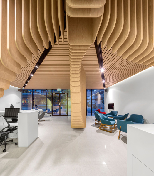
For Pedra Silva Architects, who were to design this fit-out, “the aesthetic is always a clear response to problem solving”; consequently, by deploying the camouflage principle, they turned the structural column into the highlight of the project.
.jpg) |
| . |
.jpg) |
| . |
So, Care Dentistry holds two unimpeded welcoming spaces with comfortable
waiting lounges – one for general dentistry and the other for dental implant
practice; beautifully segregated by a partially see-through fluid sculptural
wooden element that serves as an eye-catching interior element intriguing the
passersby; and a filter between the two areas.
.gif) |
| . |
Built from
suspended wooden planks that start with narrow elements widening to engulf the
existing column, this pseudo-ambulating partition is not only the predominant
functional element that works as a space generator; but also succeeds in
influencing the rest of the interiors.
Arranged around
a central corridor that houses a transparent central glass core ushering in
ample natural light, are the essentials - from examination areas, surgeries,
client areas to technical spaces. A technical highlight pleasantly surprises in
the form of a highly advanced ‘main surgery’ area that hosts complex dental
surgeries and is equipped to share them live via an observation room, situated
at a higher level.
The design -
simple yet exceptional - admirably packages the technical excellence of the
project!

.jpg)

.jpg)
.jpg)
Nice blog
ReplyDelete