Compiled by Team IAnD
Photography: Adam Mork; courtesy MVRDV
Read Time: 2 mins
Copenhagen’s new cultural
hub, Ku.Be is designed to “turn the average experience of a building on its
head”!
Ku.Be House of Culture and
Movement, a community centre for healthy and fun lifestyle opened its
doors on Sept.2, 2016 in Frederiksberg, Denmark. Designed by MVRDV – a research-based and
highly collaborative architecture studio that engages globally in providing
solutions to contemporary architectural and urban issues, and ADEPT –
architecture, planning and landscape design studio, the community space is the
first of its typology.
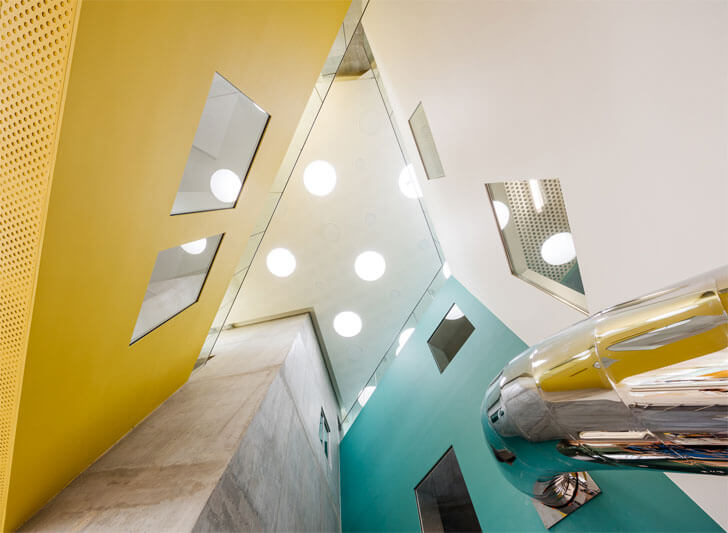 |
| The six primary volumes which make up Ku.Be, each with their own programme, are clad in a unique colour and material. Image: Adam Mork |
Designed to facilitate both
scheduled and spontaneous programmes,
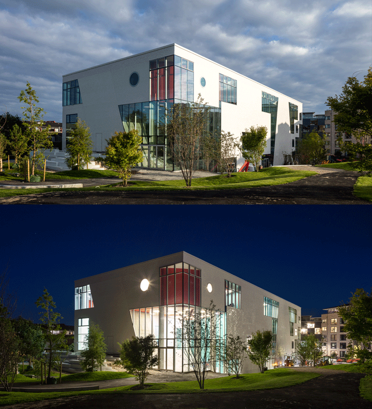
the 3200 sq. m. edifice has six primary volumes – each with its distinctive programme;
defined by a unique colour and material from within; and hinted at by a
fragmented tile facade from without.
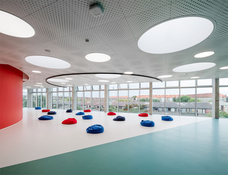 |
| Larger spaces suited to hold performances or public meetings. Image: Adam Mork |
Larger volumes are suited
to hold performances or public meetings, smaller ones for exhibitions or
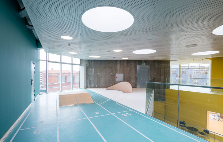
debates. The fast-pace rooms are perfect for dance, or parkour; and zen rooms
give you the contrast of yoga or meditation. However, in an effort to
“encourage the unexpected”, the real fun is targeted at spaces in between the
volumes, which cleverly hint at a use and then become entirely user-defined.
Action blends theatre,
sport and learning for everyone, regardless of age, ability or interest;
creating links between people that wouldn’t otherwise connect with each other.
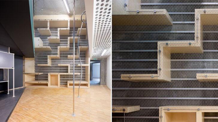
This is intriguingly
accomplished by developing and encouraging alternate forms of movement: The
Labyrinth gets people on their hands and knees climbing through a three-dimensional
network of cubes from the second to third floors; or alternatively they could
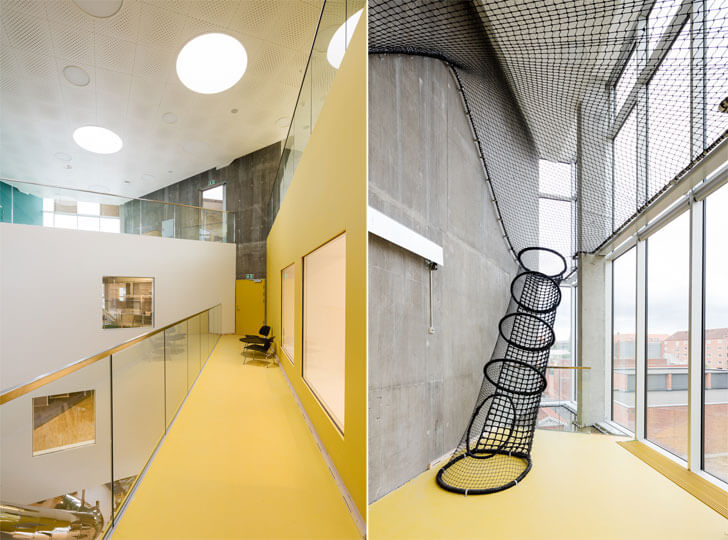
take the Mousetrap, a vertical maze. A net, which spans several floors
throughout the building, lets users climb up from floor-to-floor – suspended
over the voids – and slides and fireman poles offer a fast way to get back
down. Of course, more standard ways of moving around are also provided; either
ways, a visual connected is maintained throughout.
 |
| Slides forming part of the bulding's labyrinth to get people climbing around the building. Image: Adam Mork |
An important contribution
is essayed by the urban garden that connects Ku.Be to the urban realm and
expresses the eight volumes and the activities happening inside. The diverse
landscape - a system of micro-climates with changing sounds, lights and scents provides
a variety of interactive environments and ends in an amphitheatre outside.
 |
| Net spans several floors throughout the building, letting users climb up from floor-to-floor. Image: Adam Mork |
As Martin Krogh, co-founder
ADEPT sums up, “What would otherwise be a simple, mindless journey through the
building turns into an exploration and discovery of movement. Here, it’s you
that defines the route, however you want: climbing, sliding, crawling …
jumping.” Truly turning your average experience of a building on its head!

No comments :
Post a Comment