By Rutvi Ashar
Photography: Courtesy Office S&M
Read Time: 2 mins
 |
| . |
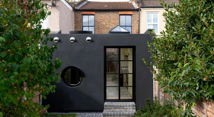
Office S&M designs an extension to a late-1800's property, highlighting it by differentiating its functions, whilst simultaneously, maintaining its scale.
Office S&M believes in designing spaces that always connect on a subliminal plane. The project in focus - Janus House is inspired from the Roman God, Janus, who is the God of duality, beginnings and is depicted with 2 faces: looking at the future as well as the past.
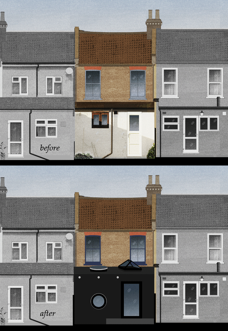 |
| Elevation |
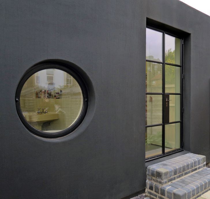
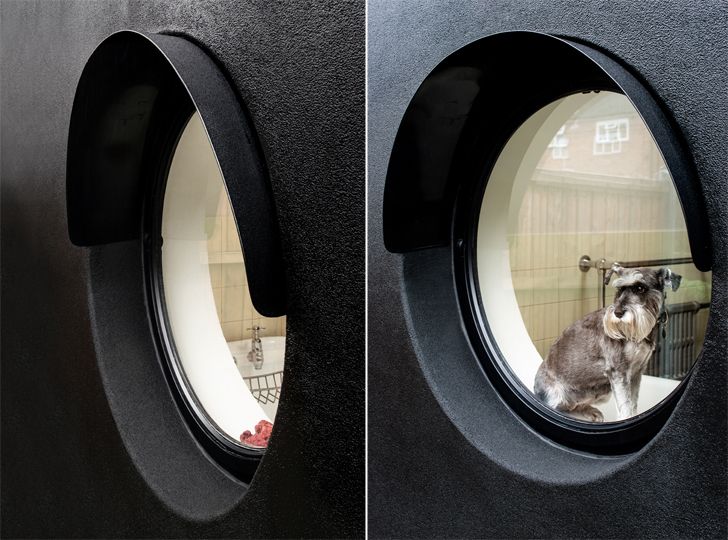
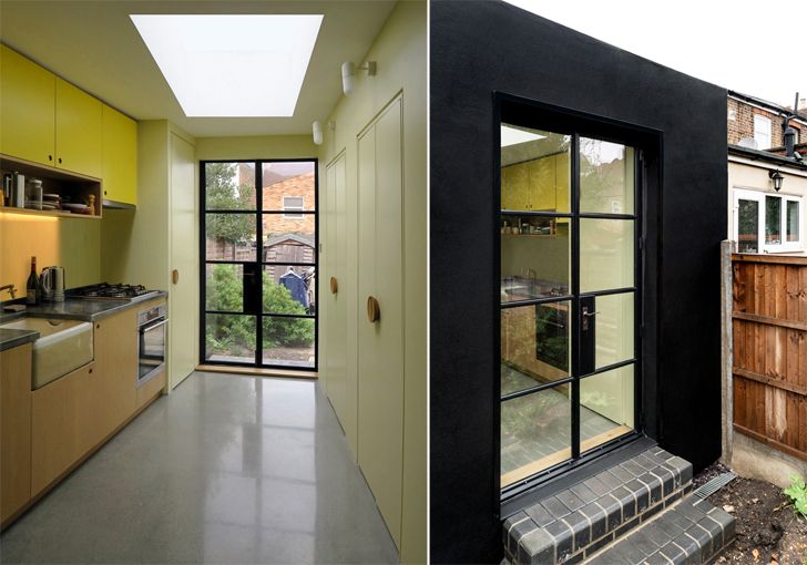
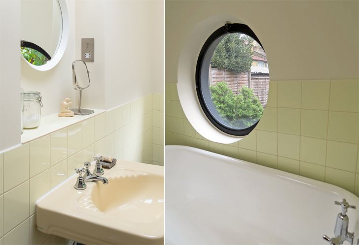
Deriving from this premise, the extension at the back of the old terraced property comprising a bathroom and a kitchen is split in two - in both plan and elevation. The ‘two-faced nature of the design is exhibited externally by the placement and shape of the window, door and rooflights: The side with circular openings houses the bathroom, while the rectangular side is the kitchen.
 |
| . |
 |
| . |
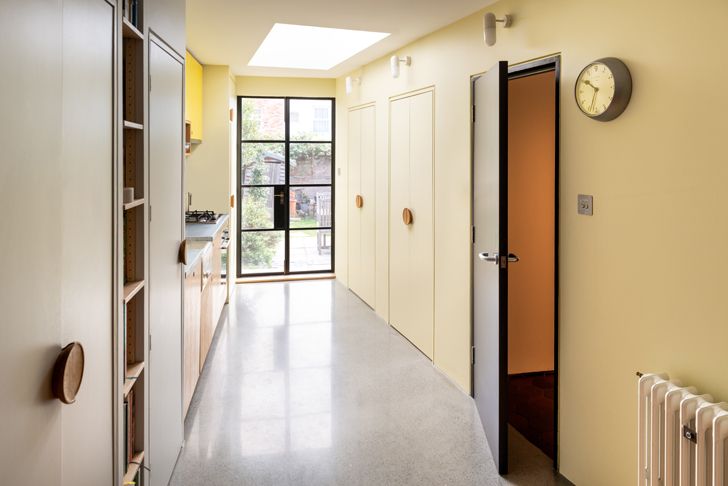
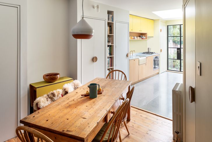
Internally, the designers make best use of the restricted space by splitting the area diagonally with a storage wall. Resourcefully applied, this wall eliminates the need for a separate circulation space as it shields the bathroom; simultaneously directing and framing views of the garden. In addition to the space constraint, the limited budget is a challenge well attended to, as both areas have their fair share of the garden view.
 |
| . |
 |
| . |
An exclusive feature of this seemingly simple project is its material palette: a sprayed-on black rubber exterior creates a monolithic background, which wraps the two halves of the extension together. This unusual industrial material, Prokol polyurea, is a low-cost option that creates a seamless finish and contrasts the existing brickwork of the terraced house. This spray originally developed for oil rigs – is waterproof, won’t weather, and is guaranteed for at least 60 years.
 |
| . |
 |
| . |
 |
| . |
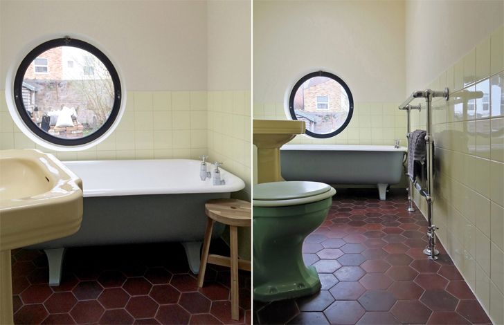
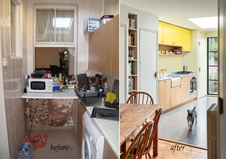
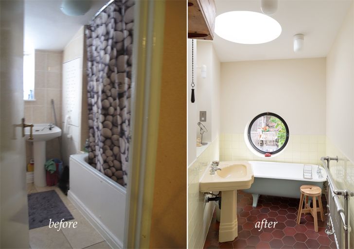
Complementing the rubber, industrial materials are used inside - such as a polished concrete floor, zinc worktop, and encaustic swimming pool tiles. These durable materials are brought to life by a yellow coloured scheme that changes in intensity from the canary yellow Formica kitchen cupboards, to the soft butter-coloured tiles in the bathroom as daylight fills homely kitchen adding to its cheerful surrounds.
 |
| . |
 |
| . |
While the design may seem simple at first glance, the effort and attention that has gone into the concept and execution effectively links the vocabulary of the extension with that of the main house.
Fact File:
Client: Janice Turner and Mike Blackwell
Design Firm: Office S&M
Built-up Area: 20 square meters (215.27 square feet)
Location: Walthamstow, London

No comments :
Post a Comment