Compiled by TeamIAnD
Photography: Heartpatrick; courtesy v2com
Read Time: 2 mins 30 secs
S/LAB10 capitalises on a sensorial response to re-examine workspace typology by refurbishing an existing bungalow to balance business cum leisure spaces…
Rising to the challenge of designing a hybrid space, the architecture and design firm, S/LAB10 delivers a spatial scheme that is simple in nature, but effective in addressing the complex demands of the client brief.
The comprehensive design scheme is both visually striking and practical in its function. The project inherits the house’s basic structure (which proved advantageous in dealing with the site’s naturally steep incline). In place, is a dexterous play of cantilevering volumes, contrasting surfaces, materials and texture, as well as the considered use and design of intricate details throughout. The consolidation of the building’s existing structural framework with a bold play of surface and volumetric elements culminates in a strong, sensual spatial experience and language throughout. And subsequently, a confident, bold architectural presence and visual identity for the client prudently set within the existing building’s typology.
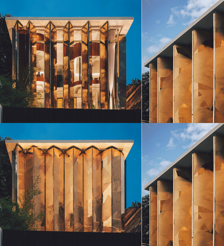
What stands out in particular in this single-unit, multi-storey former residence is its gleaming bold façade. Inspired as well by the Malaysian shophouse vernacular of folding iron shutters and looming over the quiet suburban street, the hinged and operable gold-copper alloy clad folding panels rise up from the building’s ground level, furtively shielding its interior. The triangulated facets of the matte and highly polished finishing of gold-copper alloy are seemingly arbitrary – but in essence are conceptually extrapolated from the corporation’s name and brand. Whether angled half-shut with its interiors peeking out to its suburban extents or closed in entirety for privacy and to keep out the glare of tropical light - the façade is eye-catching and captivating, its allure leaving many a visitor intrigued.
The top two floors of the building are prominently cast in operable bright gold-copper alloy panes. Once shut, the broad gold-copper panes make way for a spaciously appointed lounge beyond, concealed behind tall curtain glass panels. To the left of this is a slighter single timber-clad volume that marks the main entrance and balances the entirety of the façade’s composition. Contrasting in size and clad with locally sourced recycled timber, the protrusion is designed for dramatic effect.
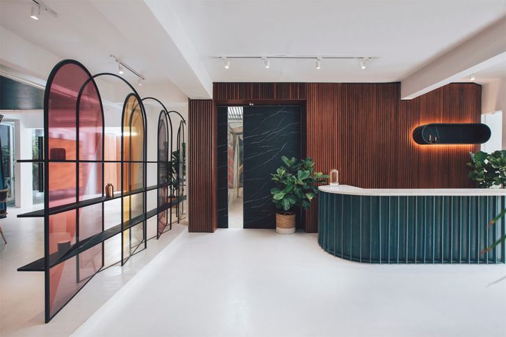
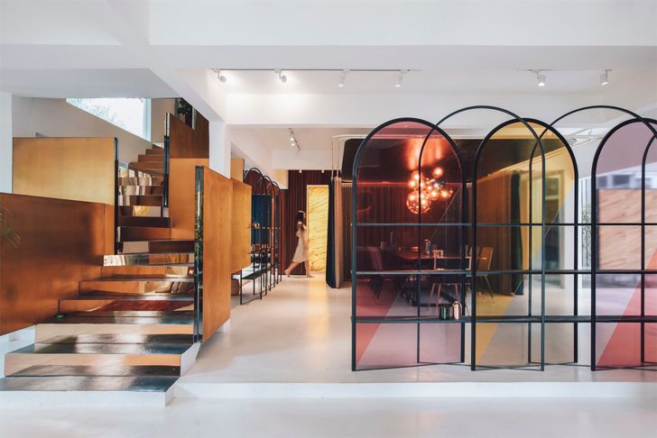
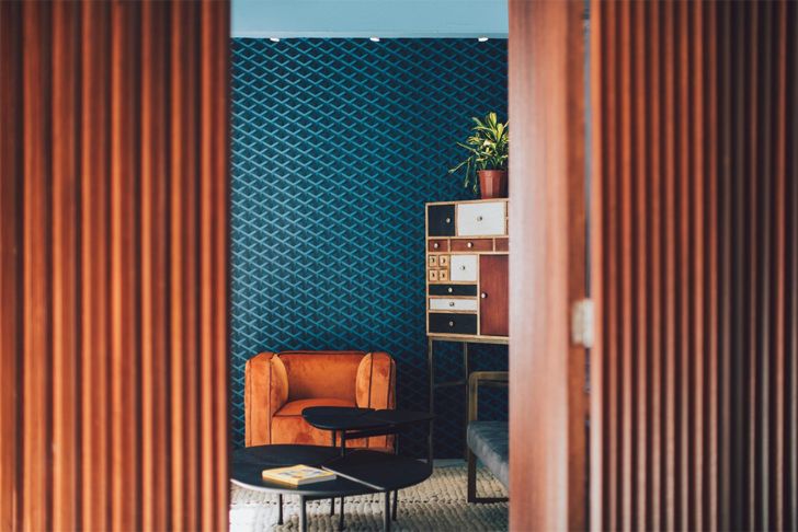
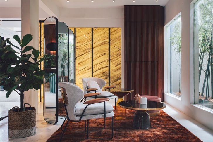
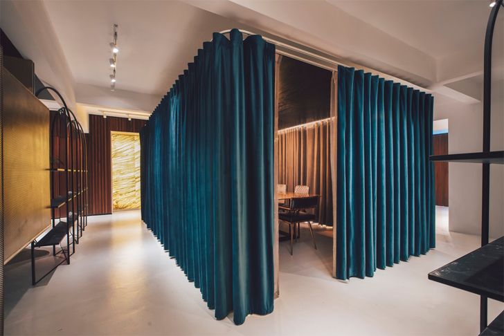
Contrasts is another key design strategy. A strong theme of bold yet methodical contrasts, or as the designers put it: “intentional mismatches”, is evident throughout, as articulated in the design’s volumetric handling of spaces as well as the contrasting play of colours, textures, materials and, in particular, its complementary custom detailing.
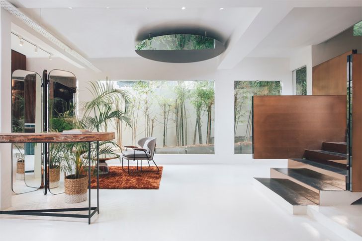
Added to this along the south-western edge of the building is an outdoor green terrace -dubbed the “bamboo terrace”- on the first floor that endorses nature and the outdoors as a significant yet subtle feature complementing the scheme’s sleek corporate interior.
By creatively exploring various complex configurations of volume and space with their respective custom crafted details, the designers successfully compose a series of work and leisure spaces, both private and open, that flow effortlessly from one to the other.
Fact File:
Client: Mantab Group Sdn Bhd
Architect Firm: S/LAB10
Lead Architect: Jason Sim
Design Team: Hao Wang, Fion Hsu & Liz Siew
Location: Bangsar, Kuala Lumpur. Malaysia




No comments :
Post a Comment