By Beverly Pereira
Photography: Natelee Cocks and Oana Minuti; courtesy the designer
Read time: 2 mins 30 secs
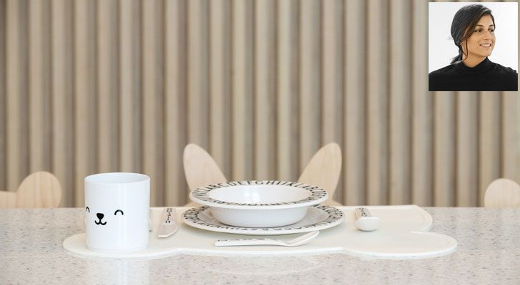 |
| World's first children's restaurant and concept store -White & the Bear (inset) Architect and designer, Sneha Divias |
Sneha Divias Atelier wields the power of minimalism, functionality and materiality to design White & the Bear, a child-focused restaurant cum concept store and activity centre in Dubai…
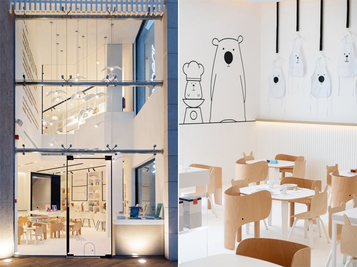
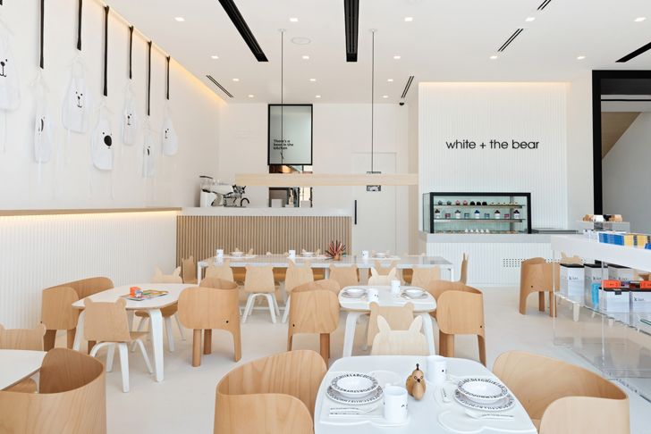
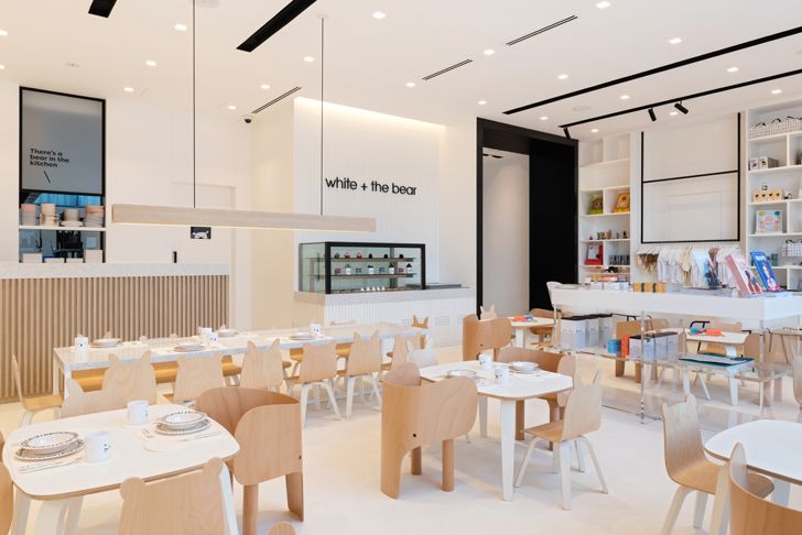
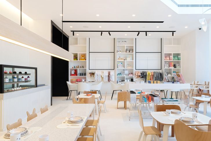
Disrupting the stereotypical colour theory that rampantly and generically advocates bright colours and pop culture graphics to define spaces for children, Sneha Divias Atelier designs White & the Bear by harnessing the calming effects of a neutral palette of greys, whites and bleached wood.
 |
| . |
 |
| . |
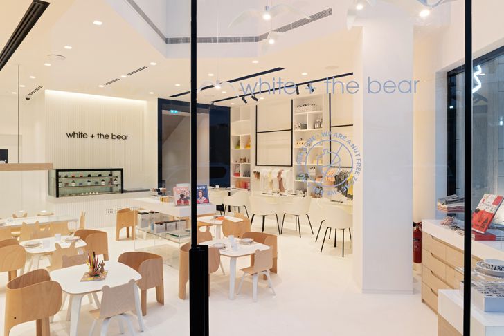
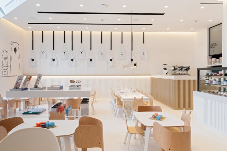
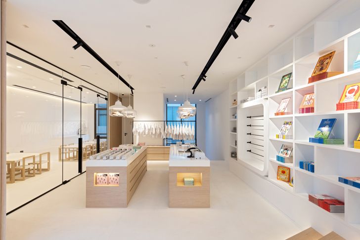
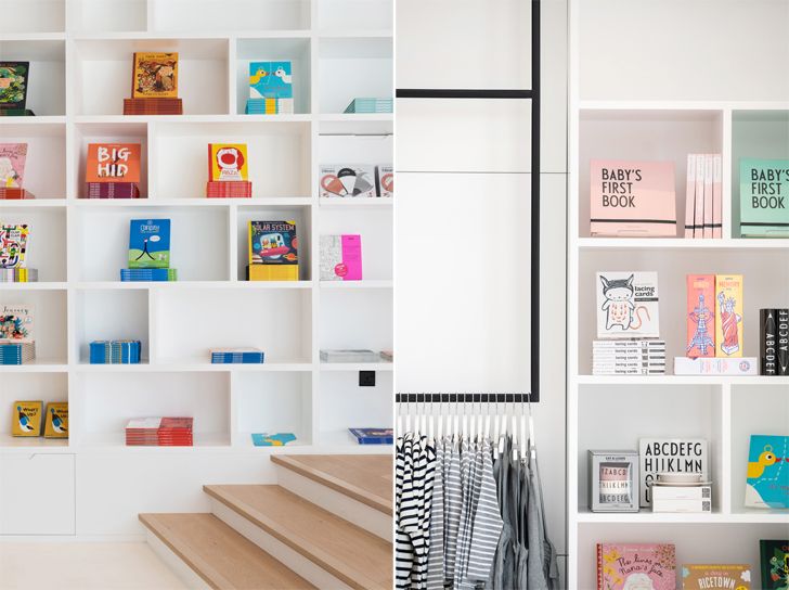
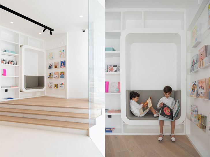
An open-plan expanse of retail cum hospitality is laid across two floors. A minimalist design against an all-white backdrop reigns throughout as eating, playing and shopping programs are defined, yet seamlessly appointed across the expanse to convenience the children and parents to get familiar with all that is on offer. Blurring the transition between the ground and first floor, a black metal arch guides visitors to a nursing room and an events space besides the retail that continues on the first floor. Here, kids can also make their pick from a selection of books before they head to cosy reading nooks.
 |
| . |
 |
| . |
 |
| . |
 |
| . |
 |
| . |
 |
| . |
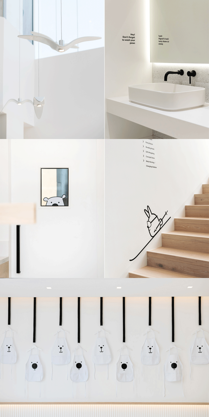
Playful yet clean graphics driven by a narrative that involves an impulsive rabbit named White, and his aide, a Bear, who is his voice of reason - instantly draws children into this adventure. The narrative becomes integral to the design in the form of chair backs, cutlery, doors, wall art and more. The warmth generated by the play of textures throughout is palpable. Even the wood slated counters, bespoke joinery and suspended metal display hangers add to the clean lines. Lacquer, veneer, metal, Corian and vinyl flooring were selected solely for materiality and functionality.
 |
| . |
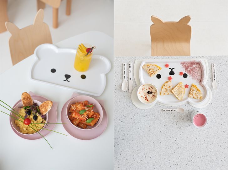
Child-size wooden chairs laid out at community tables encourage children to socialise as designated seating for parents facilitates supervision without interruption. By segregating various sections — eat, read, shop and learn — children are encouraged to maintain focus and attention on what they are observing or doing.
 |
| . |
The special design and décor are complemented by internationally acclaimed children’s nutritionist, Annabel Karmel’s exclusive kid’s menu that ensures the right balance of nutrients for kid’s meals.
The high point of this project is its sensitive approach to a three-fold focus: helping the child learn and develop his interaction skills in a conducive ambience; helping him eat right; and getting the parents to facilitate this growth and pick up tips that can regulate children’s growth patterns; in turn strengthening their bonds.
White & the Bear is a dedicated inspiring environment for children without overstimulating their senses.
 |
| . |
The successful design is the result of a consistent collaboration and synergy between all parties. The forward-thinking owner, Hana Al Mula envisioned the concept and the partnership with Annabel Karmel. The Atelier, together with the contractor Neotech and the graphic design team Yellow brought the space to life.

No comments :
Post a Comment