Compiled by team IAnD
Photography: Maarten Willemstein; courtesy the designer
Read Time: 2 mins
Studio Modijefsky renovates the erstwhile Café Bos into a traditional bistro bar Bonnie defining it with a quintessential signature style…
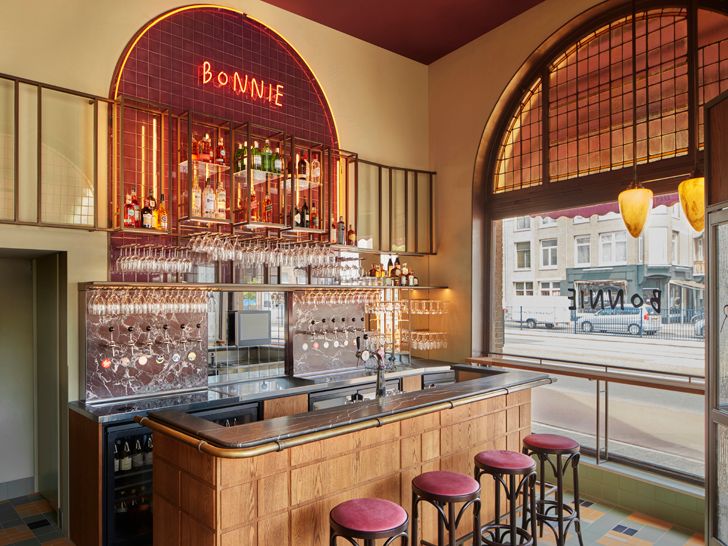
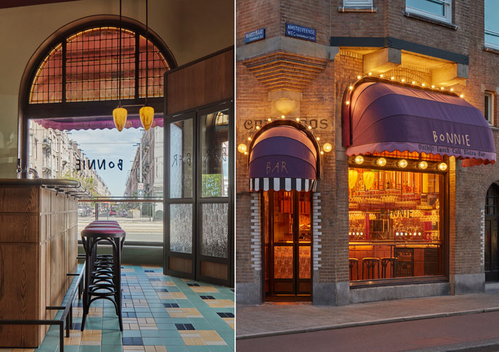
Following a close collaboration between the designer and the owner, the 119-year-old bistro fully embraces the historic fabric of the building it is in. Together with the high ceilings, two large arched windows with yellow stained glass become the defining elements of the new design, casting warm golden light into the interior.
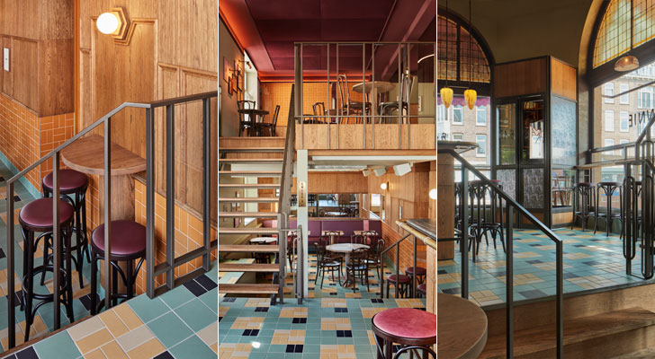
The venue is divided into three distinct areas, positioned on different floor levels. Whilst the main bar, placed directly by the entrance, gives the space a welcoming vibe, wooden stairs with a refined geometrical, bronze-coloured steel railing lead down to the souterrain and up to the mezzanine, creating a strong connection between the three levels.
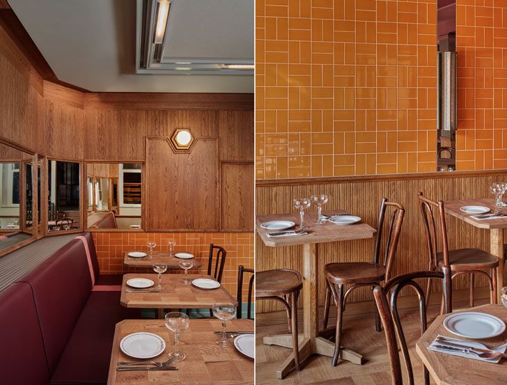
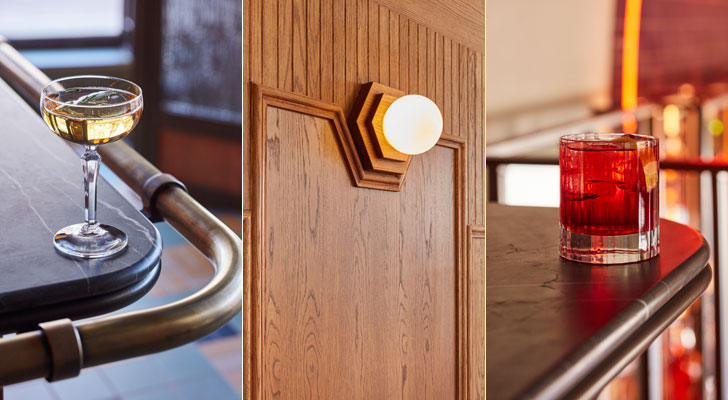
The bar and the souterrain are defined by a balance of new materials like purple red and warm grey marble, mirrors and oak wood, square patterned tiles in muted hues of yellow, green, white and black, forming a striking traditional pattern, and hexagonal wall lights blending in with wooden panelling and wainscoting panels from yore, beautifully juxtaposed with old cabinets, glass racks and cabinets for bottle display.
A more flexible plan visits the mezzanine, where a small bar, with materials echoing the main bar downstairs, ensures that this area is perfect for private events. Placed under a soft fabric ceiling in rich burgundy shade, height-adjustable tables and loose wooden chairs make for the cosiest place to have both quiet dinner and lively party.
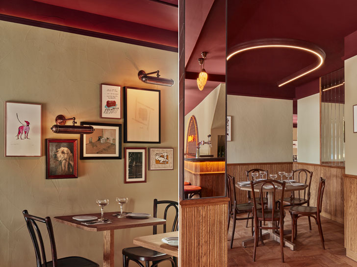
All furniture, at first appearing very traditional, has a twist, such as polygonal wooden tabletops or integrated in them chess boards. Complimented by a muted red leather bench, bespoke ceiling light fixtures give this space a warm and bright feel, honouring the ambiance of Amsterdam’s classic bars and cafés.
Named by Studio Modijefsky, Bonnie has a welcoming, amiable character. A carefully designed graphic layer and a curated collection of art, comprising both contemporary sketches and paintings from the previous owners, add a unique touch, while all used materials and features seen so many times before give the bar a homespun atmosphere.
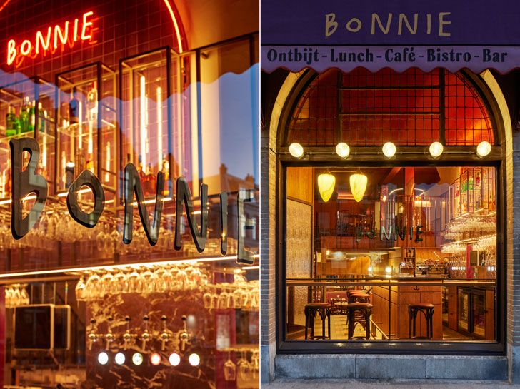
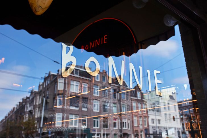
Outside, stripy awnings adorned by large string lights, with vintage textured wall lights and golden leaf logos on the large windows adding to the old-fashioned café vibes. A larger terrace placed slightly away from the building is enclosed by bespoke windscreens and planters – their design once again repeating details of the interior.
Bonnie is a nod to the past, celebrating all the devoted bar owners who served drinks and listened to stories for longer than they can remember, making everyone feel instantly at ease.
Fact File:
Project: Bonnie
Client: Drie Wijzen uit Oost
Typology: Café/ Bar
Program: Interior design & brand identity
Design Firm: Studio Modijefsky
Design Team: Esther Stam, Zahra Rajaei, Nancy Katri, Moene van Werven, Maite Margalho, Francesca Motta, Christel Willers.
Area: 147 sq. m.
Location: Amsterdam, The Netherlands



No comments :
Post a Comment